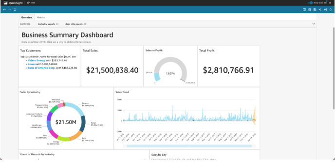
Amazon QuickSight – Dashboard Elements
Visualizations
Graphical representations of data, such as bar charts, line charts, pie charts, scatter plots, and more. You can use visualizations to explore and analyze your data, and create dashboards to share your insights with others.
Filters
Controls that allow you to select specific data points or ranges in your visualizations. You can use filters to drill down into your data and focus on specific aspects of your analysis.
Text boxes
Boxes that contain text, such as explanations or descriptions of your data or analysis. You can use text boxes to add context to your dashboards and help your readers understand what they are seeing.
Buttons
Controls that allow you to perform actions, such as switching between different views or refreshing data. You can use buttons to make your dashboards more interactive and engaging.
Images
Graphics or photos that you can add to your dashboards to add visual interest or provide context. You can use images to add personality or branding to your dashboards.
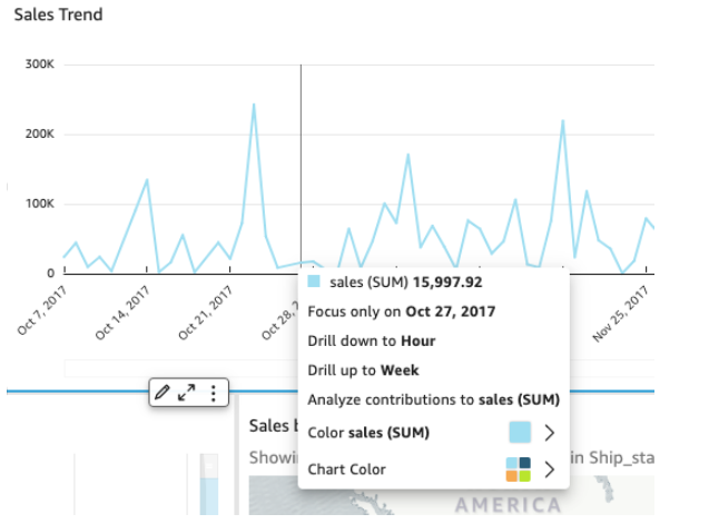
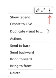
When you select a widget, a settings menu appears, offering various options such as zooming in or out, filtering data, exporting data, and more. The available options depend on the specific widget type.
There are several actions available when you select a data point,
- Focus on or exclude.
The data in a field can be focused on or excluded, such as regions, metrics, or dates. - Drill up or drill down.
Data on your dashboard may be drillable up or down so you can explore deeper details or drill up to a higher level. - Custom URL actions.
By choosing a data point or right-clicking it, you can activate custom actions on your dashboard. Using the dashboard, you might be able to send an email directly to someone. Alternatively, you can send the value you chose from this sheet to another sheet, website, or application. - Change chart colors or specific field colors.
A specific color can be selected for all chart colors. You can also change the color of an element by choosing a specific field value.
You can click or tap on a data point, for example on a bar in a bar chart, on a point where the line bends on a line chart, and so on. Depending on the type of item, different options are available. The following screenshot shows a list of actions available on most chart types.