Bootstrap Alerts
The alert component is used to provide an easy way to create predefined alert messages. Alert adds a style to your messages to make it more appealing to the users.
Syntax:
<div class=”alert> Contents… <div>
There are 4 classes that are used within div element for bootstrap alerts:
- .alert-success
- .alert-info
- .alert-warning
- .alert-danger
Example:
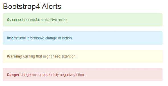
<div class="container">
 <h2>Bootstrap4 Alerts</h2>
 <div class="alert alert-success">
  <strong>Success!</strong>successful or positive action.
 </div>
 <div class="alert alert-info">
  <strong>Info!</strong>neutral informative change or action.
 </div>
 <div class="alert alert-warning">
  <strong>Warning!</strong>warning that might need attention.
 </div>
 <div class="alert alert-danger">
  <strong>Danger!</strong>dangerous or potentially negative action.
 </div>
</div>
OUTPUT:

Bootstrap 4 adds 4 new alerts in Bootstrap4 Alert:
- Primary: Indicates an important action.
- Secondary: Indicates a less important action.
- Dark: Dark grey alert box.
- Light: Light grey alert box.
Alerts are created with the .alert class.
List of all contextual classes:
- .alert-success
- .alert-info
- .alert-warning
- .alert-danger
- .alert-primary
- .alert-secondary
- .alert-light
- .alert-dark
Example:
<div class="container">
 <h2>contextual class alerts</h2>
 <div class="alert alert-success">
  <strong>Success!</strong>positive action.
 </div>
 <div class="alert alert-info">
  <strong>Info!</strong>neutral informative change.
 </div>
 <div class="alert alert-warning">
  <strong>Warning!</strong>warning.
 </div>
 <div class="alert alert-danger">
  <strong>Danger!</strong>potentially negative action.
 </div>
 <div class="alert alert-primary">
  <strong>Primary!</strong>important action.
 </div>
 <div class="alert alert-secondary">
  <strong>Secondary!</strong>less important action.
 </div>
</div>
OUTPUT:

Links in Alerts:
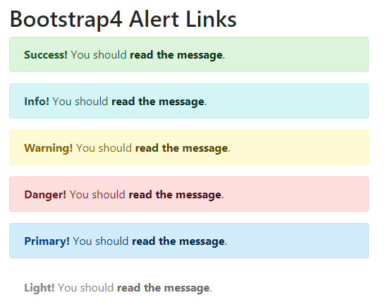
You can add the .alert-link class to any links inside the alert box to create “matching colored links”.
Example:
<div class="container">
 <h2>Bootstrap4 Alert Links</h2>
 <div class="alert alert-success">
  <strong>Success!</strong> You should <a href="#" class="alert-link">read the message</a>.
 </div>
 <div class="alert alert-info">
  <strong>Info!</strong> You should <a href="#" class="alert-link">read the message</a>.
 </div>
 <div class="alert alert-warning">
  <strong>Warning!</strong> You should <a href="#" class="alert-link">read the message</a>.
 </div>
 <div class="alert alert-danger">
  <strong>Danger!</strong> You should <a href="#" class="alert-link">read the message</a>.
 </div>
 <div class="alert alert-primary">
  <strong>Primary!</strong> You should <a href="#" class="alert-link">read the message</a>.
 </div>
 <div class="alert alert-light">
  <strong>Light!</strong> You should <a href="#" class="alert-link">read the message</a>.
 </div>
</div>
OUTPUT:

Dismissal Alerts / Closing Alerts:
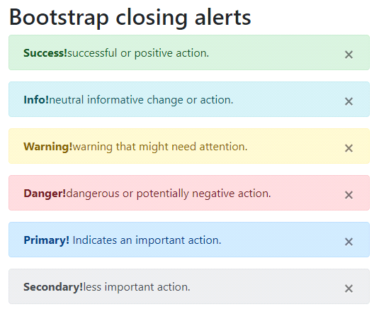
If you want to close the alert message, add a .alert-dismissible class to the alert container. Then add class=”close” and data-dismiss=” alert” to a link or a button element (which automatically dismisses the alert message box).
NOTE: × (×) is an HTML entity that is the preferred icon for close buttons, or rather than the letter “x”.
Example:
<div class="container">
 <h2>Bootstrap closing alerts</h2>
 <div class="alert alert-success alert-dismissable">
  <button type="button" class="close" data-dismiss="alert">×</button>
  <strong>Success!</strong>successful or positive action.
 </div>
 <div class="alert alert-info alert-dismissable">
  <button type="button" class="close" data-dismiss="alert">×</button>
  <strong>Info!</strong>neutral informative change or action.
 </div>
 <div class="alert alert-warning alert-dismissable">
  <button type="button" class="close" data-dismiss="alert">×</button>
  <strong>Warning!</strong>warning that might need attention.
 </div>
 <div class="alert alert-danger alert-dismissable">
  <button type="button" class="close" data-dismiss="alert">×</button>
  <strong>Danger!</strong>dangerous or potentially negative action.
 </div>
 <div class="alert alert-primary alert-dismissable">
  <button type="button" class="close" data-dismiss="alert">×</button>
  <strong>Primary!</strong> Indicates an important action.
 </div>
 <div class="alert alert-secondary alert-dismissable">
  <button type="button" class="close" data-dismiss="alert">×</button>
  <strong>Secondary!</strong>less important action.
 </div>
</div>
OUTPUT:

Animated Alerts:
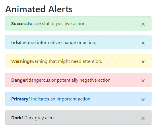
The .fade and .show classes are used to add a fading effect when closing the alert message.
Syntax:
<div class="alert alert_type alert-dismissible fade show">
  <button type="button" class="close" data-dismiss="alert">x</button>
  Alert message
<div>
Example:
<div class="container">
 <h2>Animated Alerts</h2>
 <div class="alert alert-success alert-dismissable fade show">
  <button type="button" class="close" data-dismiss="alert">×</button>
  <strong>Success!</strong>successful or positive action.
 </div>
 <div class="alert alert-info alert-dismissable fade show">
  <button type="button" class="close" data-dismiss="alert">×</button>
  <strong>Info!</strong>neutral informative change or action.
 </div>
 <div class="alert alert-warning alert-dismissable fade show">
  <button type="button" class="close" data-dismiss="alert">×</button>
  <strong>Warning!</strong>warning that might need attention.
 </div>
 <div class="alert alert-danger alert-dismissable fade show">
  <button type="button" class="close" data-dismiss="alert">×</button>
  <strong>Danger!</strong>dangerous or potentially negative action.
 </div>
 <div class="alert alert-primary alert-dismissable fade show">
  <button type="button" class="close" data-dismiss="alert">×</button>
  <strong>Primary!</strong> Indicates an important action.
 </div>
 <div class="alert alert-dark alert-dismissable fade show">
  <button type="button" class="close" data-dismiss="alert">×</button>
  <strong>Dark!</strong> Dark grey alert.
 </div>
</div>
OUTPUT:

