Bootstrap Breadcrumbs
A breadcrumb is a navigation scheme that indicates the current page’s location to the user within a website or application
Creating Breadcrumbs:
- Bootstrap simply using the class =”breadcrumb” to the <ul> or <ol> element that represents the breadcrumb.
- Add the .breadcrumb-item class to each <li> element within the breadcrumb element.
- And also, add class=”active” to the <li> that represents the current page or section which would almost always be the last crumb in the breadcrumb.
Example:
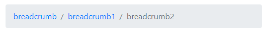
<div class="container">
  <nav>
    <ol class="breadcrumb">
      <li class="breadcrumb-item"><a href="#">breadcrumb</a></li>
      <li class="breadcrumb-item"><a href="#">breadcrumb1</a></li>
      <li class="breadcrumb-item active">breadcrumb2</li>
    </ol>
  </nav>
</div>
OUTPUT:
NOTE:
- Bootstrap 3 requires the .breadcrumb class on the <ul>
- Bootstrap 4 also requires .breadcrumb-item to be applied against each item in the breadcrumb element.
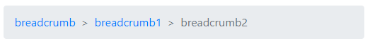
The default breadcrumb separator is /. But, you can change it with a little custom CSS.
For example, if you want to use > as a separator, you can apply the following style rules.
Example:
<div class="container">
  <nav>
    <ol class="breadcrumb">
      <li class="breadcrumb-item"><a href="#">breadcrumb</a></li>
      <li class="breadcrumb-item"><a href="#">breadcrumb1</a></li>
      <li class="breadcrumb-item active">breadcrumb2</li>
    </ol>
  </nav>
</div>
Style:
 /* Style to change separator  */
   .breadcrumb-item + .breadcrumb-item::before {
     content: ">";
   }
OUTPUT:
TIP: Bootstrap breadcrumb adds separators by using :before and content to the list as well as display: inline-block to the <li> element.