Bootstrap Carousel
The carousel is a flexible and responsive way to add a slider to your site. The Carousel built with CSS 3D transforms and a combination of javascript. It works with a text / custom markups, images and also includes previous/next controls and indicators. How to create a bootstrap carousel,
- Add .carousel and .slide classes to the container along with an ID.
- Specifying the slides in a <div> with class .carousel-inner and each slide defined with .carousel-item
Tip: Required to add the class .active to one of the slides i.e. on the .carousel-item element. Otherwise, the carousel will not be visible.
Different variations of carousel in bootstrap
1.Slides only
Slides are nothing but a single-page presentation. Collectively two or more slides may be known as a slide deck.
Slides only presence of .d-block and .img-fluid on carousel images to prevent browser default image sequence.
<div id="carouselExampleSlidesOnly" class="carousel slide" data-ride="carousel">
 <div class="carousel-inner">
  <div class="carousel-item active">
   <img class="d-block w-100" src="...">
  </div>
  <div class="carousel-item">
   <img class="d-block w-100" src="...">
  </div>
  <div class="carousel-item">
   <img class="d-block w-100" src="...">
  </div>
 </div>
</div>
OUTPUT

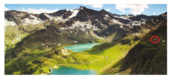
2.controls
Add to the previous and next controls in the bootstrap carousel:
<div id="carouselExampleControls" class="carousel slide" data-ride="carousel">
 <div class="carousel-inner">
  <div class="carousel-item active">
   <img class="d-block w-100" src="..."   alt="First slide">
  </div>
  <div class="carousel-item">
   <img class="d-block w-100" src="..."  alt="Second slide">
  </div>
  <div class="carousel-item">
   <img class="d-block w-100" src="..."    alt="Third slide">
  </div>
 </div>
 <a class="carousel-control-prev" href="#carouselExampleControls" role="button" data-slide="prev">
  <span class="carousel-control-prev-icon" aria-hidden="true"></span>
  <span class="sr-only">Previous</span>
 </a>
 <a class="carousel-control-next" href="#carouselExampleControls" role="button" data-slide="next">
  <span class="carousel-control-next-icon" aria-hidden="true"></span>
  <span class="sr-only">Next</span>
 </a>
</div>
OUTPUT
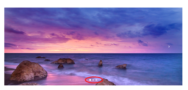
3.With indicators
Add indicators to the bootstrap carousel.
<ol class="carousel-indicators">
       <li data-target="#myCarousel" data-slide-to="0" class="active"></li>
       <li data-target="#myCarousel" data-slide-to="1"></li>
       <li data-target="#myCarousel" data-slide-to="2"></li>
       <li data-target="#myCarousel" data-slide-to="3"></li>
    </ol>
OUTPUT
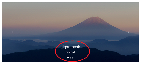
4.With captions
Add title or descriptions to your bootstrap carousel it’s easily with the .carousel-caption element within any .carousel-item.
<!--Carousel Wrapper-->
<div id="carousel-example-2" class="carousel slide carousel-fade" data-ride="carousel">
 <!--Indicators-->
 <ol class="carousel-indicators">
  <li data-target="#carousel-example-2" data-slide-to="0" class="active"></li>
  <li data-target="#carousel-example-2" data-slide-to="1"></li>
  <li data-target="#carousel-example-2" data-slide-to="2"></li>
 </ol>
 <!--/.Indicators-->
 <!--Slides-->
 <div class="carousel-inner" role="listbox">
  <div class="carousel-item active">
   <div class="view">
    <img class="d-block w-100" src=".."    alt="First slide">
    <div class="mask rgba-black-light"></div>
   </div>
   <div class="carousel-caption">
    <h3 class="h3-responsive">TEXT caption</h3>
    <p>caption text</p>
   </div>
  </div>
  <div class="carousel-item">
   <!--Mask color-->
   <div class="view">
    <img class="d-block w-100" src="..."     alt="Second slide">
    <div class="mask rgba-black-strong"></div>
   </div>
   <div class="carousel-caption">
    <h3 class="h3-responsive">TEXT caption1</h3>
    <p>caption2 text</p>
   </div>
  </div>
  <div class="carousel-item">
   <!--Mask color-->
   <div class="view">
    <img class="d-block w-100" src="..."   alt="Third slide">
    <div class="mask rgba-black-slight"></div>
   </div>
   <div class="carousel-caption">
    <h3 class="h3-responsive">TEXT caption3</h3>
    <p>caption3 text</p>
   </div>
  </div>
 </div>
 <!--/.Slides-->
 <!--Controls-->
 <a class="carousel-control-prev" href="#carousel-example-2" role="button" data-slide="prev">
  <span class="carousel-control-prev-icon" aria-hidden="true"></span>
  <span class="sr-only">Previous</span>
 </a>
 <a class="carousel-control-next" href="#carousel-example-2" role="button" data-slide="next">
  <span class="carousel-control-next-icon" aria-hidden="true"></span>
  <span class="sr-only">Next</span>
 </a>
 <!--/.Controls-->
</div>
<!--/.Carousel Wrapper-->
OUTPUT
NOTE: You want increase the time interval between each slide.you can use the time interval attribute directly on the HTML tag.
<div class="carousel" data-interval="10000">
Options:
| Name | Type | Default Value | Description |
| interval | number | 5000 | Time to delay between one slide to another slide in the automatic carousel.If false, the carousel will not automatically cycle.
|
| pause | string | hover | Pause the cycling of the carousel when mouse pointer enters the carousel and resumes the cycling when the mouse pointer leaves the carousel, by default.
|
| wrap | boolean | true | Wrap in Carousel is used continuous sliding of image and stops sliding after the last image, we can warp using data-attribute and javascript. |
| keyboard | boolean | true | The carousel should react to keyboard events. |
| ride | string | false | Autoplay the carousel after the user manually cycles the first item. If “carousel”, autoplay the carousel on load. |
| touch | boolean | true | Carousel was supporting left and right swipe interactions on touchscreen devices. |
Bootstrap carousel methods:
Bootstrap carousel methods to create ” cycle, options, pause, number, prev, next”.
.carousel(‘cycle’) : Method start bootstrap carousel for cycling through the
items from left to right.
.carousel(‘pause’) : makes the sliding images stop when the hover is placed on
the images.
.carousel(‘number’) : slide to the given number and display the given
number image.
.carousel(‘prev’) : Carousel to the previous item.
.carousel(‘next’) : Carousel to the next item.
carousel Events:
Two events for attaching to carousel functionality.
- slide.bs.carousel : Fires immediately when the slide instance method is called.
- slid.bs.carousel : Fired when the carousel has completed its slide transition.