Bootstrap Container
Containers are used to padding the content inside of them, there are 2 types of container classes in the bootstrap container.
- .container
- .container-fluid
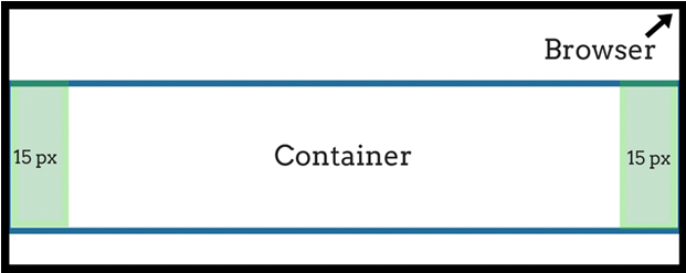
.container:
Class provides a responsive fixed width container.
Example:
  <div class="container">
  <h1>Bootstrap Page</h1>
  <p>inside a .container class.</p>
</div>

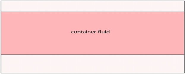
.Container-fluid:
Class provides a responsive full-width container.it will always take the entire width of the screen(width is always 100%).
Example:
  <div class="container-fluid">
  <h1>Bootstrap Page</h1>
 <p>.container_fluid class.</p>
</div>