Bootstrap Fixed Layout
.container class provides a responsive fixed width container.
Creating Fixed Layout with Bootstrap:
Create web page layouts based on a fixed number of pixels, however, the container width varies depending on the viewport width and the layout is responsive.
The process of generating the fixed yet responsive layout basically starts with the .container class. After that, you can generate rows with the .row class to wrap the horizontal groups of columns. Rows will be placed within a .container(fixed-width) for proper alignment and padding.
Columns can be created within a row using predefined grid classes like .col-*, .col-sm-*, .col-md-*, .col-lg-* and .col-xl-* where * represent grid number and should be from 1 to 12.
Note: Text, images, videos, tables, content, etc. should be placed within columns, and columns may be the immediate children of rows.
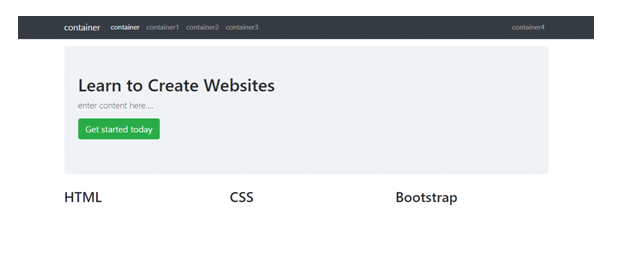
Example:
<!DOCTYPE html>
<html lang="en">
<head>
<meta charset="utf-8">
<meta name="viewport" content="width=device-width, initial-scale=1, shrink-to-fit=no">
<title>Bootstrap 4 Fixed Layout Example</title>
<link rel="stylesheet" href="https://stackpath.bootstrapcdn.com/bootstrap/4.5.2/css/bootstrap.min.css">
<link rel="stylesheet" href="https://maxcdn.bootstrapcdn.com/font-awesome/4.7.0/css/font-awesome.min.css">
<script src="https://code.jquery.com/jquery-3.5.1.min.js"></script>
<script src="https://cdn.jsdelivr.net/npm/popper.js@1.16.1/dist/umd/popper.min.js"></script>
<script src="https://stackpath.bootstrapcdn.com/bootstrap/4.5.2/js/bootstrap.min.js"></script>
</head>
<body>
<nav class="navbar navbar-expand-md navbar-dark bg-dark mb-3">
<div class="container">
<a href="#" class="navbar-brand mr-3">container</a>
<button type="button" class="navbar-toggler" data-toggle="collapse" data-target="#navbarCollapse">
<span class="navbar-toggler-icon"></span>
</button>
<div class="collapse navbar-collapse" id="navbarCollapse">
<div class="navbar-nav">
<a href="#" class="nav-item nav-link active">container</a>
<a href="#" class="nav-item nav-link">container1</a>
<a href="#" class="nav-item nav-link">container2</a>
<a href="#" class="nav-item nav-link">container3</a>
</div>
<div class="navbar-nav ml-auto">
<a href="#" class="nav-item nav-link">container4</a>
</div>
</div>
</div>
</nav>
<div class="container">
<div class="jumbotron">
<h1>Learn to Create Websites</h1>
<p class="lead">enter content here....</p>
<p><a href="#" target="_blank" class="btn btn-success btn-lg">Get started today</a></p>
</div>
<div class="row">
<div class="col-md-4">
<h2>HTML</h2>
<p>enter content here.......</p>
<p><a href="#" class="btn btn-success">Learn More »</a></p>
</div>
<div class="col-md-4">
<h2>CSS</h2>
<p>enter content here.......</p>
<p><a href="#" class="btn btn-success">Learn More »</a></p>
</div>
<div class="col-md-4">
<h2>Bootstrap</h2>
<p>enter content here.......</p>
<p><a href="#" class="btn btn-success">Learn More »</a></p>
</div>
</div>
<hr>
<footer>
<div class="row">
<div class="col-md-6">
<p>Copyright © </p>
</div>
<div class="col-md-6 text-md-right">
<a href="#" class="text-dark">Terms of Use</a>
<span class="text-muted mx-2">|</span>
<a href="#" class="text-dark">Privacy Policy</a>
</div>
</div>
</footer>
</div>
</body>
</html>
OUTPUT:
We have used the margin utility classes such as .mb-3, .ml-auto, MX-2, etc. to adjust the spacing between the elements. The classes .text-dark, .text-muted, .text-md-right, or .text-md-left are text utility classes to adjust color and alignment of text.