Bootstrap Images
Styling images and placing them properly on the web pages is very important for improving the user experience. Bootstrap 4 images provide support for images by using <img> tag.
three classes that can be used to apply some simple styles to images.
- .img-rounded
- .img-circle
- .img-thumbnail
1 .img-rounded:
Rounded corners to an image by using .rounded class.
Example:
<div class="container">
 <h2>Rounded corners image</h2>
   <img src="/examples/images/avatar.svg" class="rounded" alt="Rounded Image">

</div>
OUTPUT:
2 .img-circle :
Image as circle by using .rounded-circle class.
Example:
<div class="container">
 <h2>Rounded circle image</h2>
  <img src="/examples/images/avatar.svg" class="rounded-circle" alt="Circular Image">
</div>
OUTPUT:
3 .img-thumbnail :
Image as a thumbnail (rounded 1-pixel border) by using .img-thumbnail class.
Example:
<div class="container">
 <h2>Rounded thumbnail image</h2>
  <img src="/examples/images/avatar.svg" class="img-thumbnail" alt="Thumbnail Image">
</div>
OUTPUT:
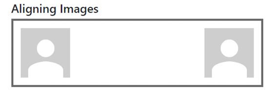
Aligning Images:
The image can be moved to the right with the .float-right class or to the left with .float-left.
Example:
<div class="container">
  <h4>Aligning Images</h4>
  <div class="box clearfix">
   <img src="/examples/images/avatar.svg" class="pull-left" alt="Sample Image">
   <img src="/examples/images/avatar.svg" class="pull-right" alt="Sample Image">
  </div>
</div>
OUTPUT:
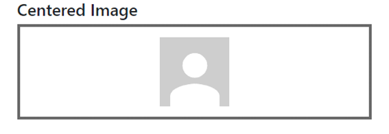
Centered Image:
Place an image in the center by using .mx-auto (margin:auto) and .d-block (display:block) classes.
Example:
<div class="container">
 <h4>Centered Image</h4>
 <div class="box text-center">
  <img src="/examples/images/avatar.svg" alt="Sample Image">
 </div>
</div>
OUTPUT:
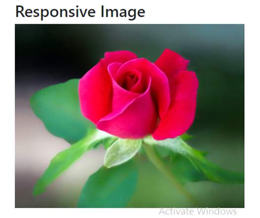
Responsive Images:
Responsive images by using the .img-fluid class (provides max-width: 100%; and height: auto; to the image).
Example:
<div class="container">
 <h2>Responsive Image</h2>
  <img class="img-fluid" src="https://images.pexels.com/photos/658687/pexels-photo-658687.jpeg?cs=srgb&dl=pexels-cindy-gustafson-658687.jpg&fm=jpg"  width="460" height="345">
</div>
OUTPUT: