Bootstrap Popovers
Popovers are generally used to display secondary information of any element and are displayed on click of mouse pointer over that element.
Creating Popovers with Bootstrap:
The data-toggle = “popover” attribute is used to create bootstrap popover, title=”popover-title” attribute is used to add the title of the popover and data-content=”popover-content” is used to add the popover content.
If you want to create a popover, add the data-toggle=”popover” attribute to an element.
Syntax:
<element data-toggle="popover" title="popover-title"
        data-content="popover-content">
  popover element
<element>
Note: bootstrap Popovers must be initialized with jQuery or select the specified element and call the popover() method.
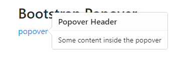
Example:
<div class="container">
 <h3>Bootstrap Popover</h3>
 <a href="#" data-toggle="popover" title="Popover Header" data-content="Some content inside the popover">popover</a>
</div>
script:
<script>
$(document).ready(function(){
 $('[data-toggle="popover"]').popover();
});
</script>
OUTPUT:
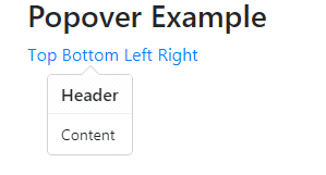
Positioning Popovers:
The data-placement attribute can be set to the top, bottom, left, or right side of the element.
Example:
<div class="container">
 <h3>Popover Example</h3>
 <a href="#" title="Header" data-toggle="popover" data-placement="top" data-content="Content">Top</a>
 <a href="#" title="Header" data-toggle="popover" data-placement="bottom" data-content="Content">Bottom</a>
 <a href="#" title="Header" data-toggle="popover" data-placement="left" data-content="Content">Left</a>
 <a href="#" title="Header" data-toggle="popover" data-placement="right" data-content="Content">Right</a>
</div>
Script:
<script>
$(document).ready(function(){
 $('[data-toggle="popover"]').popover();
});
</script>
OUTPUT:
Note: Bootstrap placement attributes do not work as you expect if it is not enough room for them.
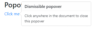
Closing Popovers:
By default, the popover is closed when the mouse clicks on double. The data-trigger=” focus” attribute is used to close the popover element when the mouse clicked outside of the element.
Example:
<div class="container">
 <h3>Popover Example</h3>
  <a href="#" title="Dismissible popover" data-toggle="popover" data-trigger="focus" data-content="Click anywhere in the document to close this popover">Click me</a>
</div>
script:
<script>
$(document).ready(function(){
 $('[data-toggle="popover"]').popover();
});
</script>
OUTPUT:
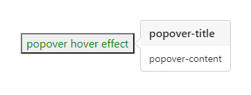
Popover hover:
data-trigger=” hover” attribute is used to create a popover hover effect. The popup will display when the mouse moves over.
Example:
<div class="container">

    <button style="color:green;" data-toggle="popover" data-trigger="hover"
        title="popover-title" data-content="popover-content">
      popover hover effect
    </button>
</div>
script:
<script>
$(document).ready(function() {
 $('[data-toggle="popover"]').popover();
});
</script>
OUTPUT: