Bootstrap Tables
Bootstrap tables allow you to arrange data into rows and columns.
You can create a table using the <table> element.Inside the <table> element you can use the <tr> elements to create row, <td> elemets to create columns, <th> elemets to create heading.
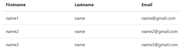
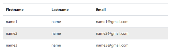
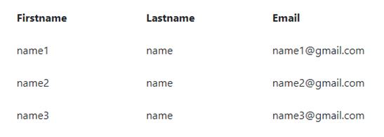
Basic Example:
<div class="container">
  <table class="table">
    <thead>
      <tr>
        <th>Firstname</th>
        <th>Lastname</th>
        <th>Email</th>
      </tr>
    </thead>
    <tbody>
     <tr>
        <td>name1</td>
        <td>name</td>
        <td>name@gmail.com</td>
      </tr>
      <tr>
        <td>name2</td>
        <td>name</td>
        <td>name2@gmail.com</td>
     </tr>
     <tr>
         <td>name3</td>
        <td>name</td>
       <td>name3@gmail.com</td>
      </tr>
    </tbody>
  </table>
</div>
OUTPUT
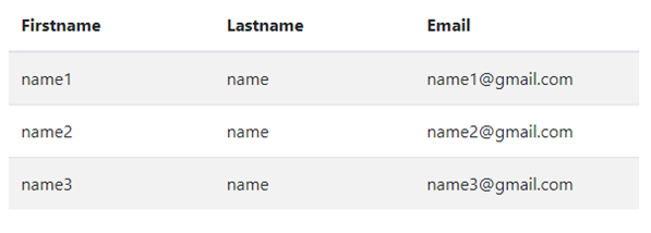
Striped Table Rows:
Adding .table-striped class to <table> element, you can create a table with alternative background colored rows.
Example:
<div class="container">
 <table class="table table-striped">
  <thead>
   <tr>
    <th>Firstname</th>
    <th>Lastname</th>
    <th>Email</th>
   </tr>
  </thead>
  <tbody>
   <tr>
    <td>name1</td>
    <td>name</td>
    <td>name1@gmail.com</td>
   </tr>
   <tr>
    <td>name2</td>
    <td>name</td>
    <td>name2@gmail.com</td>
   </tr>
   <tr>
    <td>name3</td>
    <td>name</td>
    <td>name3@gmail.com</td>
   </tr>
  </tbody>
 </table>
</div>
OUTPUT
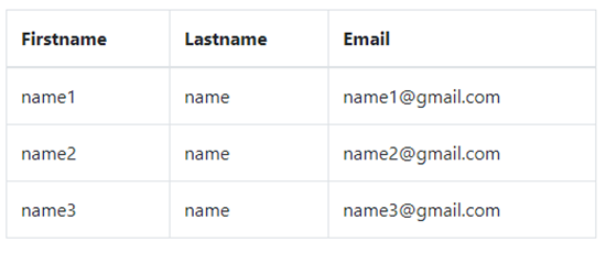
Bordered Table :
Adding .table-bordered class to <table> element, you can create a border on all sides of the table and cells.
Example:
<div class="container">
 <table class="table table-bordered">
  <thead>
   <tr>
    <th>Firstname</th>
    <th>Lastname</th><th>Email</th>
    </tr>
   </thead>
   <tbody>
    <tr>
     <td>name1</td>
     <td>name</td>
    <td>name1@gmail.com</td>
   </tr>
   <tr>
    <td>name2</td>
    <td>name</td>
    <td>name2@gmail.com</td>
   </tr>
   <tr>
    <td>name3</td>
    <td>name</td>
    <td>name3@gmail.com</td>
   </tr>
  </tbody>
 </table>
</div>
OUTPUT
Hover Rows Table :
Adding the .table-hover class is used to add a hover effect on table rows.
Example:
<div class="container">
 <table class="table table-hover">
  <thead>
   <tr>
    <th>Firstname</th>
    <th>Lastname</th>
    <th>Email</th>
   </tr>
  </thead>
  <tbody>
   <tr>
    <td>name1</td>
    <td>name</td>
    <td>name1@gmail.com</td>
   </tr>
   <tr>
    <td>name2</td>
    <td>name</td>
    <td>name2@gmail.com</td>
   </tr>
   <tr>
    <td>name3</td>
    <td>name</td>
    <td>name3@gmail.com</td>
   </tr>
  </tbody>
 </table>
</div>
OUTPUT
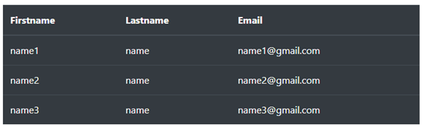
Black/Dark Table:
Adding .table-dark class to <table> element, you can adds a black background to the table.
Example:
<div class="container">
 <table class="table table-dark">
  <thead>
   <tr>
    <th>Firstname</th>
    <th>Lastname</th>
    <th>Email</th>
   </tr>
  </thead>
  <tbody>
   <tr>
    <td>name1</td>
    <td>name</td>
    <td>name1@gmail.com</td>
   </tr>
   <tr>
    <td>name2</td>
    <td>name</td>
    <td>name2@gmail.com</td>
   </tr>
   <tr>
    <td>name3</td>
    <td>name</td>
    <td>name3@gmail.com</td>
   </tr>
  </tbody>
 </table>
</div>
OUTPUT
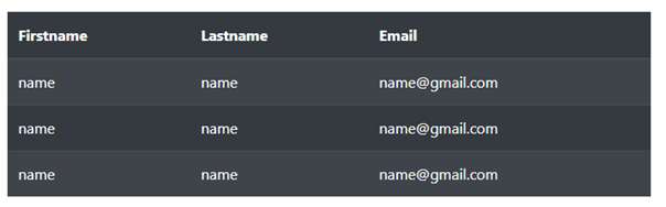
Dark Striped Table:
The combination of .table-dark and .table-striped to create a dark, striped table.
Example:
<div class="container">
 <table class="table table-dark table-striped">
  <thead>
   <tr>
    <th>Firstname</th>
    <th>Lastname</th>
    <th>Email</th>
   </tr>
  </thead>
  <tbody>
   <tr>
    <td>name</td>
    <td>name</td>
    <td>name@gmail.com</td>
   </tr>
   <tr>
    <td>name</td>
    <td>name</td>
    <td>name@gmail.com</td>
   </tr>
   <tr>
    <td>name</td>
    <td>name</td>
    <td>name@gmail.com</td>
   </tr>
  </tbody>
 </table>
</div>
OUTPUT
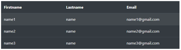
Hoverable Dark Table:
The combination of .table-dark and .table-hover classes is used to add a hover effect (grey background color)on the table.
Example:
<div class="container">
 <table class="table table-dark table-hover">
  <thead>
   <tr>
    <th>Firstname</th>
    <th>Lastname</th>
    <th>Email</th>
   </tr>
  </thead>
  <tbody>
   <tr>
    <td>name1</td>
    <td>name</td>
    <td>name1@gmail.com</td>
   </tr>
   <tr>
    <td>name2</td>
    <td>name</td>
    <td>name2@gmail.com</td>
   </tr>
   <tr>
    <td>name3</td>
    <td>name</td>
    <td>name3@gmail.com</td>
   </tr>
  </tbody>
 </table>
</div>
OUTPUT
Borderless Table:
The .table-borderless is used to remove the border from table rows and columns.
Example:
<div class="container">
 <table class="table table-borderless">
  <thead>
   <tr>
    <th>Firstname</th>
    <th>Lastname</th>
    <th>Email</th>
   </tr>
  </thead>
  <tbody>
   <tr>
    <td>name1</td>
    <td>name</td>
    <td>name1@gmail.com</td>
   </tr>
   <tr>
    <td>name2</td>
    <td>name</td>
    <td>name2@gmail.com</td>
   </tr>
   <tr>
    <td>name3</td>
    <td>name</td>
    <td>name3@gmail.com</td>
   </tr>
  </tbody>
 </table>
</div>
OUTPUT
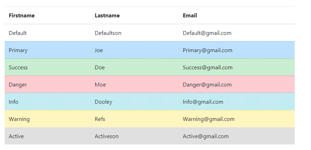
Contextual Classes:
Contextual classes can be used to color the whole table (<table>), an entire row (<tr>), or a single cell (<td>), of a table.
The list of contextual classes is: .table-primary, .table-success, .table-info, .table-warning, .table-danger, .table-active, .table-secondary, .table-light and .table-dark:
Example:
<div class="container">
 <table class="table">
  <thead>
   <tr>
    <th>Firstname</th>
    <th>Lastname</th>
    <th>Email</th>
   </tr>
  </thead>
  <tbody>
   <tr>
    <td>Default</td>
    <td>Defaultson</td>
    <td>Default@gmail.com</td>
   </tr>
   <tr class="table-primary">
    <td>Primary</td>
    <td>Joe</td>
    <td>Primary@gmail.com</td>
   </tr>
   <tr class="table-success">
    <td>Success</td>
    <td>Doe</td>
    <td>Success@gmail.com</td>
   </tr>
   <tr class="table-danger">
    <td>Danger</td>
    <td>Moe</td>
    <td>Danger@gmail.com</td>
   </tr>
   <tr class="table-info">
    <td>Info</td>
    <td>Dooley</td>
    <td>Info@gmail.com</td>
   </tr>
   <tr class="table-warning">
    <td>Warning</td>
    <td>Refs</td>
    <td>Warning@gmail.com</td>
   </tr>
   <tr class="table-active">
    <td>Active</td>
    <td>Activeson</td>
    <td>Active@gmail.com</td>
   </tr>
  </tbody>
 </table>
</div>
OUTPUT
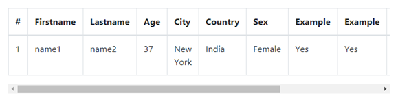
Responsive Tables:
The .table-responsive class is added to create a responsive table, scrollbar to the table when needed ( too big horizontally).
Example:
<div class="container">
<div class="table-responsive">
 <table class="table table-bordered">
  <thead>
   <tr>
    <th>#</th>
    <th>Firstname</th>
    <th>Lastname</th>
    <th>Age</th>
    <th>City</th>
    <th>Country</th>
    <th>Sex</th>
    <th>Example</th>
    <th>Example</th>
    <th>Example</th>
    <th>Example</th>
    <th>Example</th>
   </tr>
  </thead>
  <tbody>
   <tr>
    <td>1</td>
    <td>name1</td>
    <td>name2</td>
    <td>37</td>
    <td>New York</td>
    <td>India</td>
    <td>Female</td>
    <td>Yes</td>
    <td>Yes</td>
    <td>Yes</td>
    <td>Yes</td>
    <td>Yes</td>
   </tr>
  </tbody>
 </table>
</div>
</div>
OUTPUT