CSS Animation
An animation makes an element change gradually from one style to another style. Add more properties you want to add. The changes in percentage 0%-start of the animation and 100%-its completion.
Property Values:
- @keyframes: It is used to specify the animation.
- animation: Used for setting all the properties
- animation-delay: The animation will start.
- animation-direction: If or not the animation should play in reserve on alternate cycle.
- animation-duration: Time duration(animation to complete one cycle).
- animation-fill-mode: Static style of the element.
- animation-iteration-count: Number of times the animation should be played.
- animation-play-state: Animation is running or paused.
- animation-name: Name of @keyframes animation.
- animation-timing-function: Speed curve of the animation.
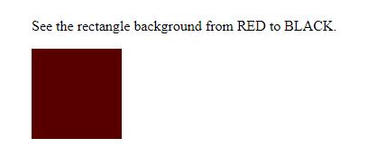
Example: changing background color
<!DOCTYPE html>
<html>
<head>
<style>
div {
  width: 100px;
  height: 100px;
  background: red;
  -webkit-animation: myfirst 6s;
  animation: myfirst 5s;
}
/* Chrome, Safari, Opera */
@-webkit-keyframes myfirst {
 from {background: red;}
 to {background: black;}
}
/* Standard syntax */
@keyframes myfirst {
 from {background: red;}
 to {background: black;}
}
</style>
</head>
<body>

<p>See the rectangle background from RED to BLACK.</p>
<div></div>
</body>
</html>
OUTPUT:
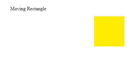
Example: Moving Rectangle
<!DOCTYPE html>
<html>
<head>
<style>
div {
  width: 100px;
  height: 100px;
  background: red;
  position: relative;
  -webkit-animation: myfirst 5s; /* Chrome, Safari, Opera */
  animation: myfirst 5s;
}
/* Chrome, Safari, Opera */
@-webkit-keyframes myfirst {
 0%   {background:red; left:0px; top:0px;}
 25%  {background:yellow; left:300px; top:0px;}
 50%  {background:blue; left:200px; top:300px;}
 75%  {background:green; left:0px; top:200px;}
 100% {background:red; left:0px; top:0px;}
}
/* Standard syntax */
@keyframes myfirst {
 0%   {background:red; left:0px; top:0px;}
 25%  {background:yellow; left:300px; top:0px;}
 50%  {background:blue; left:300px; top:200px;}
 75%  {background:green; left:0px; top:200px;}
 100% {background:red; left:0px; top:0px;}
}
</style>
</head>
<body>
<p>Moving Rectangle</p>
<div></div>
</body>
</html>
OUTPUT: