CSS background-blend-mode
The CSS background-blend-mode property fixes the blend mode for each background layer (image/color) of an element. blend the background images together / can blend them with background-color.
CSS Syntax:
background-blend-mode: normal|multiply|screen|overlay|darken|lighten|color-dodge|saturation|color|luminosity;
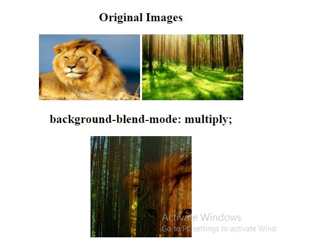
multiply:
Set the blending mode to multiply.
Example:
<!DOCTYPE html>
<html>
<head>
<style>
#div1 img{
width: 200px;
height: 130px;
}
#example{
 width: 200px;
 height: 200px;
 background-repeat: no-repeat;
 background-image: url("lion.png"), url("forest.jpg");
 background-blend-mode: multiply;

}
</style>
</head>
<body>
<center>
<div id = "div1">
<h2> Original Images </h2>
<img src = "lion.png">
<img src = "forest.jpg">
</div>
<h2> background-blend-mode: multiply; </h2>
<div id="example"></div>
</center>
</body>
</html>
OUTPUT:
screen:
Two images on the projection screen.
Example:
<!DOCTYPE html>
<html>
<head>
<style>
#div1 img{
width: 300px;
height: 130px;
}
#example{
 width: 200px;
 height: 200px;
 background-repeat: no-repeat;
 background-image: url("lion.png"), url("forest.jpg");
 background-blend-mode: screen;

}
</style>
</head>
<body>
<center>
<div id = "div1">
<h2> Original Images </h2>
<img src = "lion.png">
<img src = "forest.jpg">
</div>
<h2> background-blend-mode: screen; </h2>
<div id="example"></div>
</center>
</body>
</html>
OUTPUT:

color-dodge:
Dividing the background-color by the inverse of the background-image.
Example:
<!DOCTYPE html>
<html>
<head>
<style>
#div1 img{
width: 300px;
height: 130px;
}
#example{
 width: 200px;
 height: 200px;
 background-repeat: no-repeat;
 background-image: url("lion.png"), url("forest.jpg");
 background-blend-mode: color-dodge;

}
</style>
</head>
<body>
<center>
<div id = "div1">
<h2> Original Images </h2>
<img src = "lion.png">
<img src = "forest.jpg">
</div>
<h2> background-blend-mode: color-dodge; </h2>
<div id="example"></div>
</center>
</body>
</html>
OUTPUT:

Difference:
Subtracting the dark color from the lightest one.
Example:
<!DOCTYPE html>
<html>
<head>
<style>
#div1 img{
width: 300px;
height: 130px;
}
#example{
 width: 200px;
 height: 200px;
 background-repeat: no-repeat;
 background-image: url("lion.png"), url("forest.jpg");
 background-blend-mode: difference;

}
</style>
</head>
<body>
<center>
<div id = "div1">
<h2> Original Images </h2>
<img src = "lion.png">
<img src = "forest.jpg">
</div>
<h2> background-blend-mode: difference; </h2>
<div id="example"></div>
</center>
</body>
</html>
OUTPUT:
