CSS background-clip
The CSS background-clip specifies the painting area of the background.
The property values:
- border-box
- padding-box
- content-box
- inherit
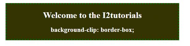
border-box:
The background image and color will be drawn inside the border-box.
Example:
<!DOCTYPE html>
<html>
  <head>
    <style>
      div {
        background-color: #333300;
        background-clip: border-box;
        text-align: center;
        border:5px dotted #006600;
      }
      h1,h2{
      color: White;
      }
    </style>
  </head>

  <body>
    <div>
      <h1>
       Welcome to the I2tutorials
      </h1>
      <h2>
       background-clip: border-box;
      </h2>
        </div>
    </body>
</html>
OUTPUT:

padding-box:
It sets the background within the border.
Example:
<!DOCTYPE html>
<html>
  <head>
    <style>
      div {
        background-color: #cc3300;
        background-clip: padding-box;
        padding: 25px;
        text-align: center;
        border:5px dashed #990033;
      }
      h1,h2{
      color: white;
      }
    </style>
  </head>

  <body>
    <div>
      <h1>
       Welcome to the I2tutorials
      </h1>
      <h2>
       background-clip: padding-box;
      </h2>
    </div>
  </body>
</html>
OUTPUT:


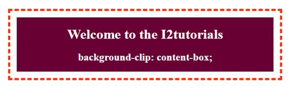
content-box:
The background-color up to the content only.
Example:
<!DOCTYPE html>
<html>
  <head>
    <style>
      div {
        background-color: #660033;
        background-clip: content-box;
        padding: 15px;
        text-align: center;
        border:5px dashed #ff3300;
      }
      h1,h2{
      color: white;
      }
    </style>
  </head>

  <body>
    <div>
     <h1>
      Welcome to the I2tutorials
     </h1>
     <h2>
      background-clip: content-box;
     </h2>
    </div>
  </body>
</html>
OUTPUT: