CSS border-image
This CSS property allows you to specify an image is to be used in place of the border styles.
Syntax:
border-image: [ source slice width outset repeat ] | initial | inherit
Property Values:
- border-image-source: Location of the image to be used for the border.
- border-image-slice: The top, right, bottom, and left edges of the border image.
- border-image-width: The width of the border.
- border-image-outset: Area extends beyond the border box.
- border-image-repeat: Scaled or tiled so that it can match the size of the border.
- initial: Property to its default value.
- inherit: The property from its parent element.
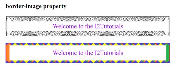
Example:
<!DOCTYPE html>
<html>
<head>
<title>
CSS border-image Property
</title>

<style>
p{
border: 10px solid transparent;
padding: 15px;
text-align:center;
font-size: 25px;
color: darkviolet;
}
#border {
border-image: url('border.png')  60 / 20px 20px round;

}
#border1 {
border-image: url('diamond.png')  43 / 10px 15px round stretch;

}
</style>
</head>

<body>
<h2>border-image property</h2>

<p id = "border">
Welcome to the I2Tutorials
</p>
<p id = "border1">
Welcome to the I2Tutorials
</p>
</body>
</html>
OUTPUT:
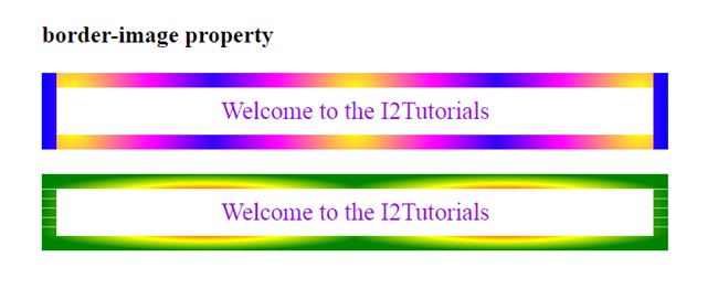
Example – using radial-gradient
<!DOCTYPE html>
<html>
<head>
<title>
CSS border-image Property
</title>

<style>
p{
border: 10px solid transparent;
padding: 15px;
text-align:center;
font-size: 25px;

color: darkviolet;
}

#border1 {
border-image: radial-gradient(circle, yellow, magenta, blue) 30 / 15px repeat;
}
#border2 {
border-image: radial-gradient(farthest-side, red, yellow, green) 30 / 15px round;

}

</style>
</head>

<body>
<h2>border-image property</h2>

<p id = "border1">
Welcome to the I2Tutorials
</p>
<p id = "border2">
Welcome to the I2Tutorials
</p>
</body>
</html>
OUTPUT: