CSS Buttons
In HTML, we use the button element to generate a button, but by using CSS properties. Buttons help to create user interaction and event processing.
Basic styling in Buttons:
There are different properties available that are used to style the button element.
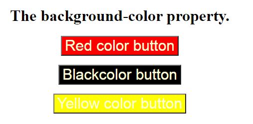
background-color:
Background-color property is used for setting the background color of the button tag.
Syntax
element {
  background-color: color_name|transparent|initial|inherit;
}
Example:
<!DOCTYPE html>
<html>

<head>
  <title>
    button background Color
  </title>

  <style>
  body{
   text-align: center;
  }
    button {
     color:lightgoldenrodyellow;
     font-size: 30px;
    }
    .b1 {
      background-color: red;
    }
    .b2 {
      background-color: Black;
    }
    .b3 {
      background-color: Yellow;
    }
  </style>
</head>

<body>
 <h1>The background-color property.</h1>
  <button class="b1">Red color button</button><br> <br>
  <button class="b2">Blackcolor button</button> <br><br>
  <button class="b3">Yellow color button</button>
</body>
</html>
OUTPUT:
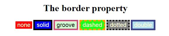
border:
The border is used to set the border of the button and it is the shorthand property for border-width, border-color, and border-style.
Syntax:
element {
  // border style
}
Example:
<!DOCTYPE html>
<html>

<head>
  <title>
    button background Color
  </title>

  <style>
  body{
   text-align: center;
  }
    button {
      color:lightgoldenrodyellow;
      font-size: 20px;
  }
    .b1 {
      background-color: red;
      border:none;
  }
    .b2 {
      background-color: blue;
      border:5px black solid;
  }
    .b3 {
      background-color: #ccffcc;
      color:black;
      border:5px #ff6699 groove;
  }
    .b4{
      background-color:#1aff1a;
      border: 5px #ff9900 dashed;
  }
    .b5{
      background-color: gray;
      border: 5px black dotted;
  }
    .b6{
      background-color: lightblue;
      border:5px #000066 double;
  }
  </style>
</head>

<body>
 <h1>The border property</h1>
  <button class="b1">none</button>
  <button class="b2">solid</button>
  <button class="b3">groove</button>
  <button class="b4">dashed</button>
  <button class="b5">dotted</button>
  <button class="b6">double</button>
</body>
</html>
OUTPUT:
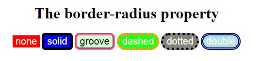
border-radius:
Border-radius is used to make the rounded corners of the button. It sets the border radius of the button.
Syntax:
element {
  // border-radius property
}
Example:
<!DOCTYPE html>
<html>

<head>
  <title>
    button background Color
  </title>

  <style>
  body{
   text-align: center;
  }
    button {
      color:lightgoldenrodyellow;
      font-size: 20px;
    }
    .b1 {
      background-color: red;
      border:none;
    }
    .b2 {
      background-color: blue;
      border:5px black solid;
      border-radius: 7px;
    }
    .b3 {
      background-color: #ccffcc;
      color:black;
      border:5px #ff6699 groove;
      border-radius: 10px;
    }
    .b4{
      background-color:#1aff1a;
      border: 5px #ff9900 dashed;
      border-radius: 20px;
    }
    .b5{
      background-color: gray;
      border: 5px black dotted;
      border-radius: 30px;
    }
    .b6{
      background-color: lightblue;
      border:5px #000066 double;
      border-radius: 25px;
    }
  </style>
</head>

<body>
 <h1>The border-radius property</h1>
  <button class="b1">none</button>
  <button class="b2">solid</button>
  <button class="b3">groove</button>
  <button class="b4">dashed</button>
  <button class="b5">dotted</button>
  <button class="b6">double</button>

</body>
</html>
OUTPUT:
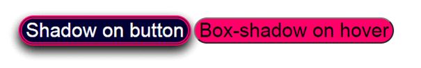
box-shadow:
Box-shadow is creating the shadow of the button box and is used to add the shadow to the button. We can also provide a shadow during the hover on the button.
Syntax:
box-shadow: [horizontal offset] [vertical offset] [blur radius]
              [optional spread radius] [color];
Example:
<!DOCTYPE html>
<html>

<head>
  <title>
    button background Color
  </title>

  <style>
  body{
   text-align: center;
  }
    button {
      color:lightgoldenrodyellow;
      font-size: 30px;
    }
    .b1{
      background-color: #000033;
      border:5px #ff0066 double;
      border-radius: 25px;
      color:white;
      box-shadow : 0 8px 16px 0 black,
           0 6px 20px  0 rgba(0, 0, 0, 0.19);
    }
    .b2{
      background-color: #ff0066;
      border:5px #000033dotted;
      color:black;
      border-radius: 25px;
    }
    .b2:hover{
      box-shadow : 0 8px 16px 0 black,
           0 6px 20px  0 rgba(0, 0, 0, 0.19);
    }
  </style>
</head>

<body>
  <button class="b1">Shadow on button</button>
  <button class="b2">Box-shadow on hover</button>
</body>
</html>
OUTPUT:
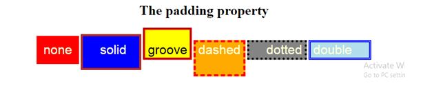
padding:
It is used to set the button padding.
Syntax:
element {
  // padding style
}
Example:
<!DOCTYPE html>
<html>

<head>
<title>
 button background Color
</title>

  <style>
  body{
   text-align: center;
  }
     button {
      color:lightgoldenrodyellow;
      font-size: 30px;
    }
    .b1 {
      background-color: red;
      border:none;
      padding: 16px;
    }
    .b2 {
      background-color: blue;
      border:5px brown solid;
      padding:15px 30px 25px 40px;
    }
     .b3 {
      background-color: yellow;
      color:black;
      border:5px red groove;
      padding-top:30px;
    }
    .b4{
      background-color:orange;
      border: 5px red dashed;
      padding-bottom:40px;
    }
    .b5{
      background-color: gray;
      border: 5px black dotted;
      padding-left: 40px;
    }
    .b6{
      background-color: lightblue;
      border:5px blue double;
      padding-right: 40px;;
    }
  </style>
</head>

<body>
 <h1>The padding property</h1>
  <button class="b1">none</button>
  <button class="b2">solid</button>
  <button class="b3">groove</button>
  <button class="b4">dashed</button>
  <button class="b5">dotted</button>
  <button class="b6">double</button>

</body>
</html>
OUTPUT: