CSS clip-path
It is a basic shape or to an SVG source.It provides a particular region of the element to display, instead of displaying the entire area. The basic shapes – ellipse, circle, polygon, or inset keywords.
Property values:
- clip-source : URL to an SVG <clipPath> element.
- basic-shape : circle, ellipse, polygon or inset .
- margin-box : margin box as the reference box.
- border-box : border box as the reference box.
- padding-box : padding box as the reference box.
- content-box : content box as the reference box.
- fill-box : object bounding box as reference box.
- stroke-box : stroke bounding box as reference box.
- view-box : SVG viewport as reference box.
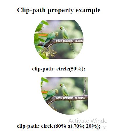
circle:
Example:
<!DOCTYPE html>
<html>
 <head>
 </head>
 <style>
  .example {
  clip-path: circle(50%);
  }
        .example1{
  clip-path: circle(60% at 70% 20%);
  }
 </style>
 <body>
 <center>
  <h2> Clip-path property example </h2>
        <img src="good-morning.jpg" class="example">
   <h3>clip-path: circle(50%);</h3>
        <img src="good-morning.jpg" class="example1">
        <h3>clip-path: circle(60% at 70% 20%);</h3>
        </center>
 </body>
</html>
OUTPUT:

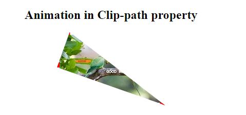
Adding animation:
Example:
<!DOCTYPE html>
<html>
 <head>
 </head>
 <style>
img.example {
 animation: anime 4s infinite;
 border: 5px dashed red;
}

@keyframes anime {
 0% {
  clip-path: polygon(0 0, 100% 0, 100% 80%, 0% 70%);
 }
 20% {
  clip-path: polygon(40% 0, 50% 0, 100% 100%, 0% 80%);
 }
 40% {
  clip-path: polygon(0 0, 60% 72%, 100% 100%, 0 35%);
 }
 60% {
  clip-path: polygon(70% 0, 20% 0, 100% 100%, 0% 80%);
 }
 80% {
  clip-path: polygon(0 70%, 60% 0, 100% 32%, 0 40%);
 }
 100% {
  clip-path: polygon(0 0, 60% 0, 100% 100%, 0% 30%);
 }
}
 </style>
  <body>
  <center>
   <h2> Animation in Clip-path property </h2>
         <img src="good-morning.jpg" class="example">
         </center>
 </body>
</html>
OUTPUT:

