CSS overlay
It is used to set one thing on top of another. The overlay is a web-page attractive, and it is easy to design.
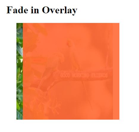
Fade overlay effect:
Move the cursor on the image, then the overlay will be shown on the top of the image.
Example:
<!DOCTYPE HTML>
<html>
<head>
  <title>Image Overlay</title>
  <style>
    .container img {
       width: 300px;
       height: 300px;
    }
    .container {
       position: relative;
       width: 25%;
       height: auto;
    }

    .overlay{
      position: absolute;
      transition: 0.5s ease;
      height: 300px;
      width: 300px;
      top: 0;
      left: 20px;
      background-color: #ff6633;
    opacity: 0;
    }
    .container:hover .overlay {
      opacity: 0.9;
    }

  </style>
</head>

<body>
  <center>

<h1>Fade in Overlay</h1>
<div class="container">
       <img src= "good-morning.jpg">
       <div class="overlay"></div>
    </div>
  </center>
</body>

</html>
OUTPUT:
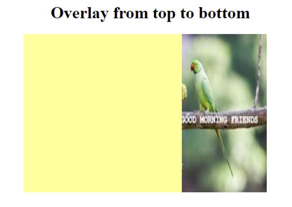
Slide in Overlay from top to bottom:
Example:
<!DOCTYPE HTML>
<html>
<head>
  <style>
    .container img {
       width: 300px;
       height: 300px;
    }
    .container {
       position: relative;
       width: 25%;
       height: auto;
    }
    .container:hover .overlay {
       opacity: 1;
       height: 300px;
    }
    .overlay{
      position: absolute;
      transition: 0.7s ease;
      opacity: 0;
      width: 300px;
      height: 0;
      top: 0;
      right: 20px;
      background-color: #ffff99;;
    }

  </style>
</head>

<body>
  <center>

<h1>Overlay from top to bottom</h1>
<div class="container">
       <img src= "good-morning.jpg">
       <div class="overlay"></div>
    </div>
  </center>
</body>

</html>
OUTPUT:
Slide in Overlay from bottom to top:
Example:
<!DOCTYPE HTML>
<html>
<head>
  <style>
    .container img {
       width: 300px;
       height: 300px;
    }
    .container {
       position: relative;
       width: 25%;
       height: auto;
    }
    .container:hover .overlay {
       opacity: 1;
       height: 300px;
    }
    .overlay{
      position: absolute;
      transition: 0.7s ease;
      opacity: 0;
      width: 300px;
      height: 0px;
      bottom: 0;
      right: 20px;
      background-color: #ff99e6;;
    }

  </style>
</head>

<body>
  <center>

<h1>Overlay from bottom to top</h1>
     <img src= "good-morning.jpg">
      <div class="overlay"></div>
    </div>
  </center>
</body>
</html>
OUTPUT:

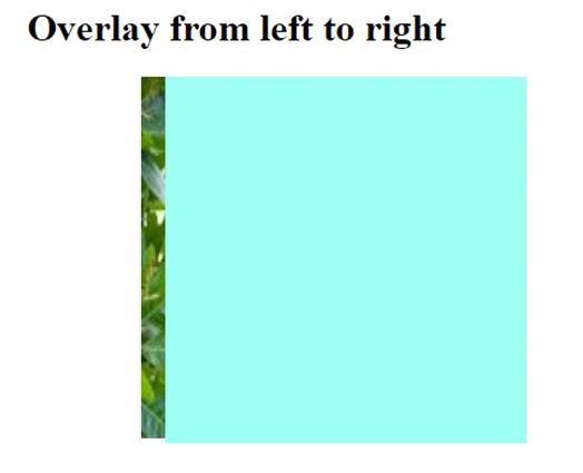
Slide in Overlay from left to right:
Example:
<!DOCTYPE HTML>
<html>
<head>
  <style>
    .container img {
       width: 300px;
       height: 300px;
    }
    .container {
       position: relative;
       width: 25%;
       height: auto;
    }
    .container:hover .overlay {
       opacity: 1;
       width: 300px;
    }
    .overlay{
      position: absolute;
      transition: 0.7s ease;
      opacity: 0;
      width: 0;
      height: 100%;
      bottom: 0;
      left: 20px;
      background-color: #99ffeb;;
    }

  </style>
</head>

<body>
  <center>

<h1>Overlay from left to right</h1>
<div class="container">
       <img src= "good-morning.jpg">
       <div class="overlay"></div>
    </div>
  </center>
</body>

</html>
OUTPUT:
Slide in Overlay from right to left:
Example:
<!DOCTYPE HTML>
<html>
<head>
  <style>
    .container img {
       width: 300px;
       height: 300px;
    }
    .container {
       position: relative;
       width: 25%;
       height: auto;
    }
    .container:hover .overlay {
       opacity: 1;
       width: 300px;
    }
    .overlay{
      position: absolute;
      transition: 0.7s ease;
      opacity: 0;
      width: 0;
      height: 100%;
      bottom: 0;
      right: 20px;
      background-color: #ffbb99;;
    }

  </style>
</head>

<body>
  <center>

<h1>Overlay from right to left</h1>
<div class="container">
       <img src= "good-morning.jpg">
       <div class="overlay"></div>
      </div>
    </center>
  </body>

</html>
OUTPUT:
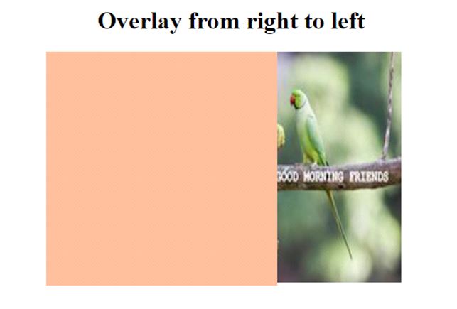
Image Overlay title:
Example:
<!DOCTYPE html>
<html>
<head>
<meta name="viewport" content="width=device-width, initial-scale=1">
<style>
 body{
  text-align: center;
 }
* {box-sizing: border-box;}

.container {
 position: relative;
 width: 50%;
 max-width: 300px;
}

img {
 display: block;
 width: 100%;
 height: auto;
}

.overlay {
 position: absolute;
 bottom: 0;
 background: rgba(0, 0, 0, 0.2);
 width: 100%;
 opacity:0;
 transition: .9s ease;
 font-size: 25px;
 padding: 20px;
}

.container:hover .overlay {
 opacity: 1.5;
}
</style>
</head>
<body>

<h1>Image Overlay Title Effect</h1>

<center>
<div class="container">
   <img src="good-morning.jpg">
   <div class="overlay">Welcome to I2tutorials</div>
</div> </center>

</body>
</html>
OUTPUT:

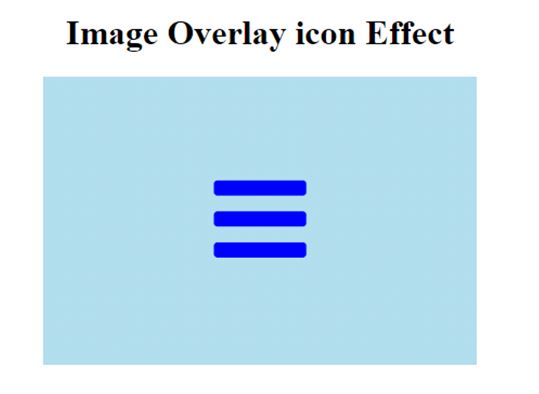
Image Overlay icon:
Example:
<!DOCTYPE html>
<html>
<head>
<meta name="viewport" content="width=device-width, initial-scale=1">
<link rel="stylesheet" href="https://cdnjs.cloudflare.com/ajax/libs/font-awesome/4.7.0/css/font-awesome.min.css">
<style>
.container {
 position: relative;
 width: 100%;
 max-width: 400px;
}

.image {
 display: block;
 width: 100%;
 height: auto;
}

.overlay {
 position: absolute;
 top: 0;
 height: 100%;
 width: 100%;
 opacity: 0;
 transition: 1s ease;
 background-color: lightblue;
}

.container:hover .overlay {
 opacity: 1;
}

.icon {
 color: blue;
 font-size: 100px;
 position: absolute;
 top: 50%;
 left: 50%;
 transform: translate(-50%, -50%);
}

</style>
</head>
<body>
<center>
<h1>Image Overlay icon Effect</h1>

<div class="container">
 <img src="good-morning.jpg" class="image">
 <div class="overlay">
 <a href="#" class="icon">
       <i class="fa fa-bars"></i>
 </a>
 </div>
</div>
</center>
</body>
</html>
OUTPUT: