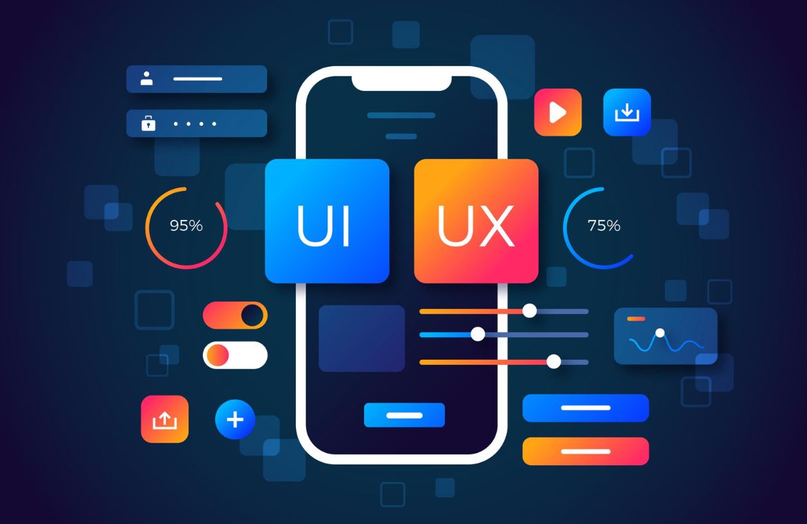
Designing for All: How Visual Design Affects Accessibility in UX
In the digital age, our lives are increasingly intertwined with websites, apps, and digital interfaces. Yet, for a significant portion of the population, these interactions can be frustrating, confusing, or even impossible due to accessibility barriers. Accessibility in User Experience (UX) design means ensuring that digital products are usable by everyone, regardless of their abilities or disabilities. At the heart of this inclusive approach lies visual design, which, when thoughtfully applied, can either open doors or create insurmountable hurdles for users.
The Power of Visuals: More Than Just Aesthetics
Visual design encompasses everything from color choices and typography to layout, iconography, and the use of white space. While often perceived as purely aesthetic, these elements play a critical role in how users perceive, understand, and interact with a digital interface. For users with visual impairments, cognitive disabilities, motor limitations, or even situational disabilities (like using a phone in bright sunlight), visual design choices can make or break their experience.
Consider the impact of:
- Color Contrast: Insufficient contrast between text and background can render content unreadable for individuals with low vision or color blindness.
- Typography: Small font sizes, overly decorative fonts, or insufficient line spacing can make text difficult to decipher for users with dyslexia or other reading difficulties.
- Layout and Hierarchy: A cluttered or inconsistent layout can overwhelm users with cognitive disabilities, making it hard to find information or complete tasks.
- Interactive Elements: Buttons and links that are too small, too close together, or lack clear visual cues can be challenging for users with motor impairments or those relying on screen readers.
When visual design is approached with accessibility in mind, it transforms from a mere aesthetic consideration into a powerful tool for inclusion. It ensures that information is perceivable, operable, understandable, and robust for all users. For those looking to build a career in this impactful field, a comprehensive UI UX design course in Hyderabad or elsewhere can provide the foundational knowledge and practical skills needed to create truly inclusive digital experiences.
Key Visual Design Principles for Accessibility:
- High Contrast Ratios: Adhering to WCAG (Web Content Accessibility Guidelines) standards for color contrast ensures readability for users with various visual impairments. Tools are available to check contrast ratios.
- Clear and Legible Typography: Using readable fonts, appropriate font sizes (with options for scaling), sufficient line height, and good letter spacing improves readability for everyone.
- Meaningful Use of Color: Never rely on color alone to convey information. Use additional visual cues like icons, text labels, or patterns to ensure information is accessible to colorblind users.
- Consistent and Predictable Layouts: A consistent visual hierarchy and predictable navigation patterns reduce cognitive load and help users with cognitive disabilities understand where they are and what to do next.
- Sufficient Spacing and Target Sizes: Providing ample white space around interactive elements and ensuring touch targets are large enough benefits users with motor impairments and those using touchscreens.
- Focus Indicators: Clearly visible focus indicators (e.g., a strong outline around a button when tabbed to) are crucial for keyboard navigation and screen reader users.
- Descriptive Iconography: Icons should be universally understandable and, where necessary, accompanied by text labels or alt text for screen readers.
The Business Case for Accessible Design
Beyond the ethical imperative, designing for accessibility makes strong business sense. It expands your potential user base, improves SEO, enhances brand reputation, and can even reduce legal risks. An accessible product is often a better product for everyone, as features designed for users with disabilities often benefit the general user population (e.g., captions for videos benefit those in noisy environments).
Cultivating Inclusive Design Skills
The demand for designers who can create accessible and inclusive digital products is growing rapidly. Employers are increasingly recognizing the value of designers who understand not just aesthetics, but also the principles of universal design and accessibility standards. For aspiring designers, choosing a UI UX design course that emphasizes accessibility throughout its curriculum is a significant advantage. These courses teach designers how to conduct accessibility audits, use assistive technologies, and integrate inclusive design practices into every stage of the design process, from user research to prototyping and testing.
Conclusion: Designing a More Inclusive Digital World
Visual design is a powerful lever for accessibility in UX. By consciously applying principles of contrast, typography, layout, and interactive element design, designers can ensure that digital products are not just beautiful, but also usable and enjoyable for everyone. Embracing accessible visual design is not merely a compliance checkbox; it’s a commitment to creating a more inclusive, equitable, and user-friendly digital world for all.


