Power BI – Build Reports
With the Report view feature in Power BI Desktop, you can create numerous report pages containing visualizations. In addition, Power BI Desktop enables you to manipulate your queries and model your data to ensure that it provides the most valuable insights for your reports. Finally, you have the freedom to save your Power BI Desktop file to your local drive or to the cloud.
Reports in Power BI Desktop
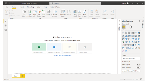
You can add data to your report using the basic Report view in Power BI Desktop.

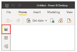
By selecting the icons on the left-hand navigation pane, you can switch between Report, Data, and Model views

In the canvas, you can add fields once you’ve added some data.

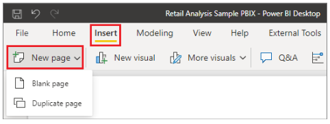
There will be at least one blank page at the beginning of the report. The navigation area at the bottom of the Report view displays pages. Having too many visualizations on a page makes it difficult to find the right information. Your report can be expanded by adding new pages. Then, select Blank from the Insert tab on the ribbon.

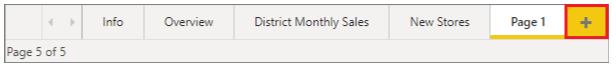
To create a new page, select the + icon next to the pages in the navigation area below the canvas.

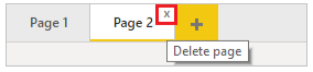
At the bottom of the Report view, select the x to delete a page.

Copy and paste between reports
Power BI Desktop allows you to copy visuals from one report to another. Ctrl+C can be used to copy visuals from one report and Ctrl+V to paste them into another. Power BI Desktop allows you to copy and paste one visual at a time, or all visuals on a page.
Visual elements relying on a theme or the default settings update automatically to match the theme of the destination report, as well as settings and formatting explicitly set in the formatting pane. That way, you can copy and paste the visual into new reports and preserve the formatting.
A warning will appear if the fields in your model are different, and an error will appear on the visual.
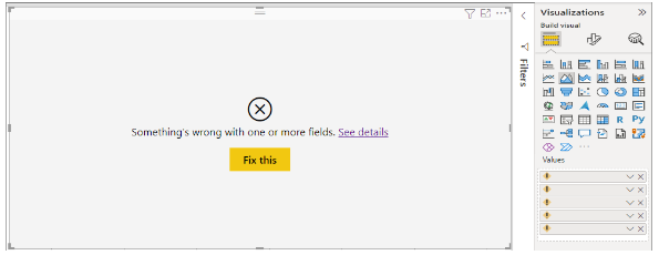

To replace the broken fields with the fields you want to use from the model in the report to which you pasted the visual to correct the error. A custom visual must also be imported to the destination report if you are using one.
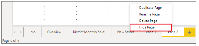
Hide report pages
Reports can also be hidden from pages when they are created. The approach may be useful if you need to create underlying data or visuals in a report, but you don’t want those pages to be visible to others, such as when you create tables or supporting visuals that are used on other report pages. You might want to create a report page, then hide it from a report you want to publish for many other creative reasons.
It’s easy to hide a report page. From the menu that appears, right-click on the report page tab and select Hide.

When hiding a report page, keep the following points in mind:
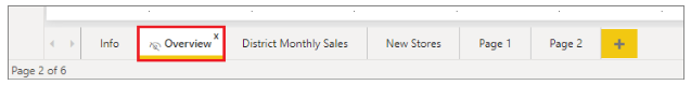
- Although the page shows a hidden icon, you can still see a hidden report view in Power BI Desktop. The Overview page is hidden in the following image.

- A hidden report page cannot be seen in the Reading view of the Power BI service, but it can be seen in the Edit view.
- Your report readers will see the hidden page when you save the report, then publish it to Power BI.
- Hide a report page is not a security measure. Users can still access the page and its content via drillthrough.
- View mode navigation arrows do not appear when a page is hidden.
The Report view has seven main areas
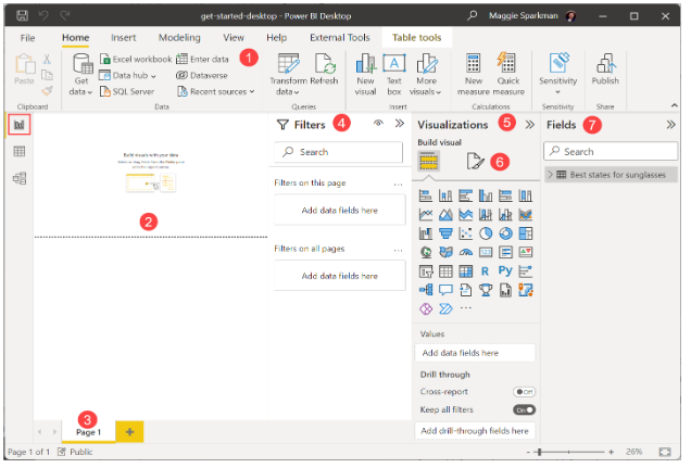

- A ribbon at the top displays common report and visualization tasks.
- Visualizations are created and arranged on the canvas.
- At the bottom, you can select or add report pages.
- You can filter data visualizations in the Filters pane.
- Add, change, or customize visualizations, and apply drillthroughs in the Visualizations pane.
- You design the report and visualizations in the Format pane.
- View the available fields in your queries in the Fields pane. Visualizations can be created by dragging these fields onto the canvas, the Filters pane, or the Visualizations pane.
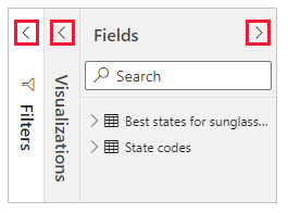
By selecting the arrows at the tops of the Filters, Visualizations, and Fields panes, you can expand or collapse them. By collapsing the panes, more space is available on the canvas.

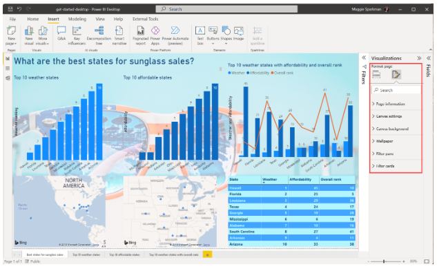
To drag any field from the Fields list onto the canvas to create a simple visualization. Try dragging the State field from Best states for sunglass sales onto the canvas.
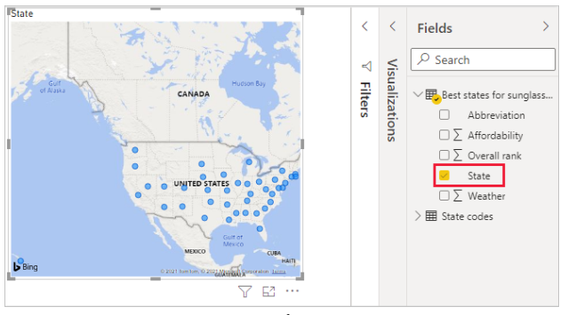

When Power BI Desktop recognized that the State field contained geolocation data, it automatically created a map-based visualization. Your data model shows data points for 40 states.
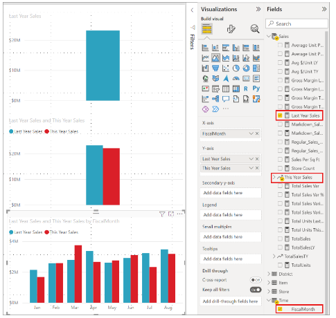
You can modify the visualization from the Visualizations pane.
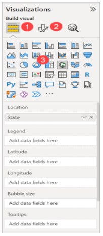

- In the Visualization pane, you can drag data fields to the Legend and other field wells.
- Formatting and other controls are available in the Format option.
- Icons indicate the type of visualization. By selecting another icon, you can change the type of a selected visualization, or create a new visualization.
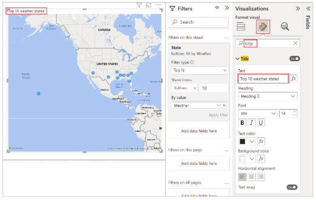
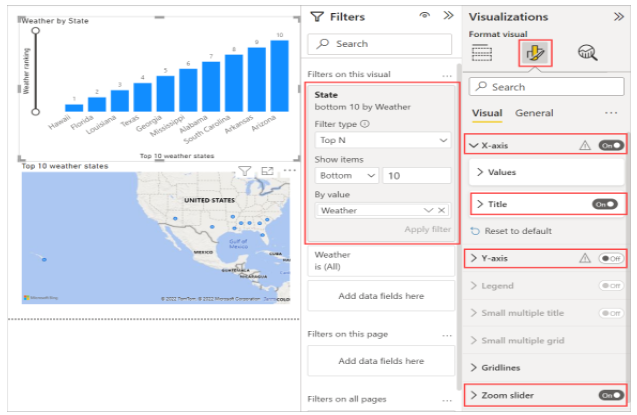
Expand the arrow under State is (All) to show only the top 10 states. You want to show the items with the lowest numerical rank. Under Filter type, select Top N. Enter 10 under Show items.
Drag the Weather field from the Fields pane into the By value field, and then select Apply filter.


The map visualization now shows only the top 10 weather states.
To retitle your visualization. Type title in the Search box of the Format icon in the Visualization pane. Under Text, type Top 10 weather states.

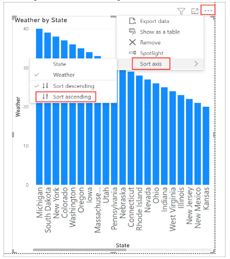
To choose a blank area of the canvas and then select the Clustered column chart icon from the Visualization pane to add a visualization showing the top 10 weather states and their rankings. Select State and Weather in the Fields pane. This column chart shows the 40 states in your query, ranked from worst to best weather.
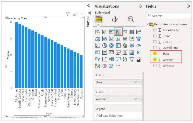

To Select More options (…) at the upper right of the visualization, and select Sort ascending from the menu to change the order of the ranking.

To apply the same bottom 10 filter that you applied to the map visualization to the table.
The visualization should be titled the same way as the map. Change Y axis > Axis title from Weather to Weather ranking in the Format section of the Visualization pane. Then turn off the Y axis. Set the Zoom slider to On, and turn on Data labels.
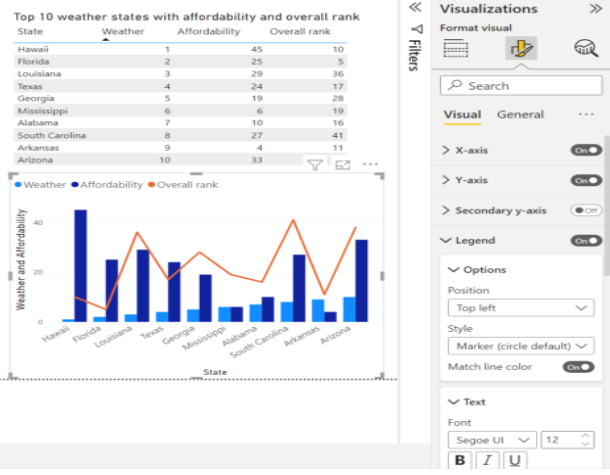
Listed below are the top 10 weather states ranked numerically.

You can combine several fields into one visualization, such as affordability and overall ranking. You can create all sorts of interesting reports and visualizations. Table, line, and clustered column charts show the top 10 weather states along with affordability and overall ranking

Different visualizations can be displayed on different report pages. You can add a new page by clicking the + symbol next to the existing pages on the pages bar or by selecting Insert > New Page in the Home tab. You can rename a page by double-clicking its name in the pages bar, or by right-clicking it and selecting Rename Page. From the pages bar, select a different page of the report.


The Insert group of the Home tab lets you add text boxes, images, and buttons to your report pages. You can set formatting options for visualizations by selecting the Format icon in the Visualizations pane. Select the Format icon without selecting a visualization to set page sizes, backgrounds, etc.