Tableau – Bubble Chart
What is Bubble Chart?
A bubble chart in Tableau is a type of data visualization that shows data in bubbles or circles of varying sizes and colors. Multiple variables can be displayed in a bubble chart due to its design. A dimension field value is represented by a bubble, and the measure field value provides the bubble’s size and color. This allows us to analyze plots with at least three variables, one dimension and two measure fields.
As you can see, a bubble chart or packed bubble chart in Tableau is a simple yet detailed and insightful visual that can easily be created by following the steps below.
How to Create Bubble Chart in Tableau?
Here are the steps you need to follow in order to create a packed bubble chart in Tableau:
STEP 1: Add Dimension Field
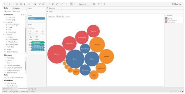
In the Columns section, we add Category as the first dimension field.
STEP 2: Add Measure Field
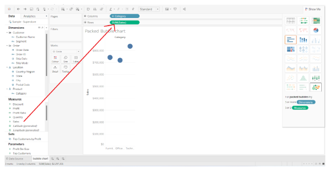
The next step is to add a measure field, Sales, and keep its aggregation type as SUM.
STEP 3: Select Packed Bubble Option
The next step is to select the Packed bubbles option from the visualization pane. To access the visualization pane, click on the Show Me option.
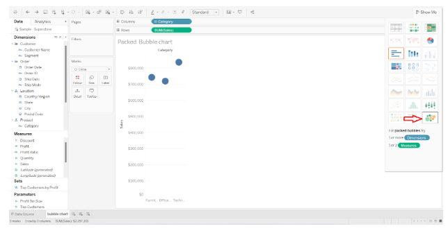
This creates a bubble chart with bubbles of different sizes and colors (in accordance with a color gradient). A bubble’s size is proportional to the value that the bubble represents, and its color corresponds to where the field value falls within the range.
In the screenshot below, you can see that the bubble chart displays sales by category. From lowest to highest, the color gradient indicates the range of profits.
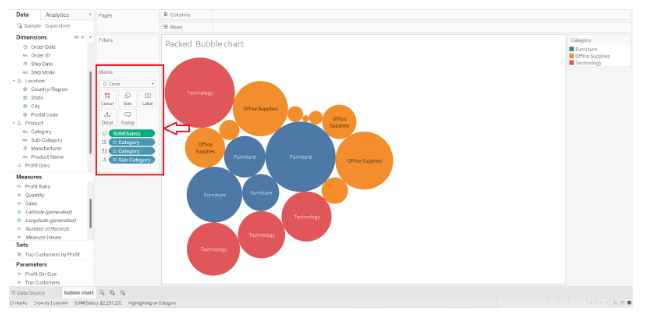
The Marks section also shows all the fields used to create this bubble chart. We can drag and drop fields from Dimensions and Measure sections into different cards, such as Color, Label, Detail, Tooltip, etc. If you want to change the color scheme, right-click on the Color card and use the options that appear.
STEP 4: Edit and Format Bubble Chart
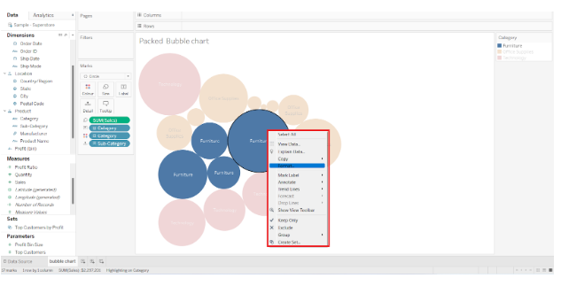
The bubble chart can also be formatted by right-clicking and exploring the format panel.
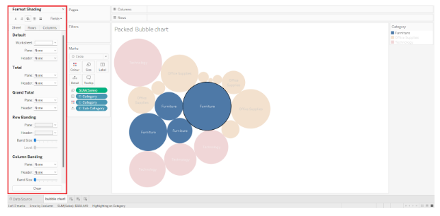
Almost every aspect of the chart can be edited and formatted using the format pane on the left.
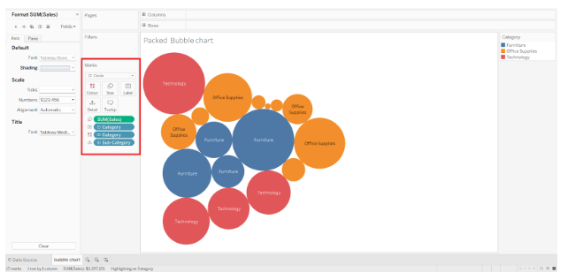
STEP 5: Final Representation of Tableau Bubble Chart
This creates a bubble chart, which in Tableau is also called as a packed bubble chart. Based on the color gradient shown in the bubble chart below, the total sales and profits are proportional to the values and size of each category and subcategory.
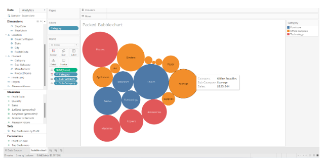
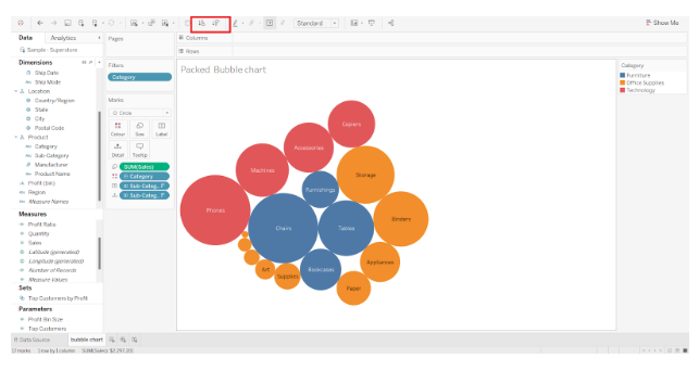
We also created another bubble that shows the total sales value for each subcategory or brand. Although, if you pay attention, you will notice that the color scheme is based on the three categories of furniture,office supplies , and technology.
Sort in Tableau Bubble Chart
Additionally, Tableau allows us to sort the bubbles based on the data values in ascending or descending order. Clicking on the two sort options on the toolbar allows you to sort ascending or descending.
Format Text in Tableau Bubble Chart
Data labels on bubbles can also be formatted. In the Marks section, click the Labels card to format the text. There are several formatting options available, such as Text, Font, Alignment, and Marks to Label.
To edit the data labels, click on the … icon and add new fields with their names to show dataLabels on the bubbles. In addition, you can choose from a list of available fonts, align the text as you wish, and adjust other settings.
This is how we can create the bubble chart in tableau
