
Tableau – Dashboard
Creating a Dashboard in Tableau
Tableau dashboards are collections of different kinds of visualizations or views. On a dashboard, we can combine elements from multiple worksheets. Using the dashboard option, we can import and add charts and graphs from worksheets. Dashboards allow us to display relevant charts and graphs in one view and analyze them.
We will now learn how to create a dashboard in Tableau Desktop step by step.
- Open a new dashboard
A dashboard window can be opened either from the Dashboard option on the menu bar or from the Dashboard icon highlighted in red on the bottom bar.
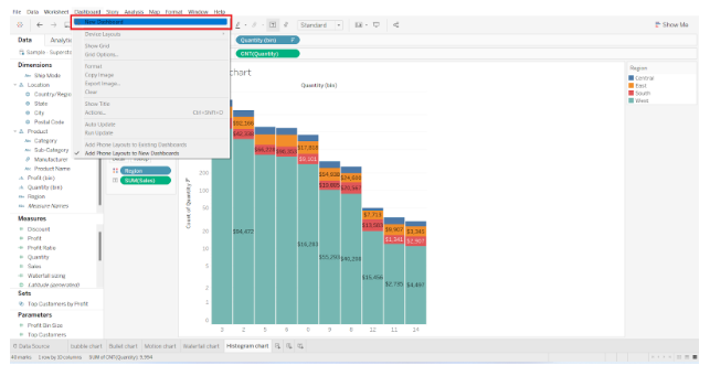

A new window named Dashboard 1 will open when you select the New Dashboard option or click on the Dashboard icon. The dashboard name can be changed according to your preferences.
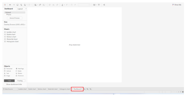

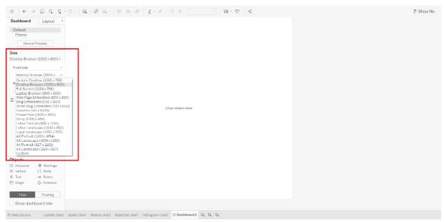
- Dashboard pane
There are many tabs and options related to dashboarding in the window where we can create our dashboard. We have a Dashboard pane on the left, which displays the dashboard size, a list of sheets in a workbook, objects, etc.
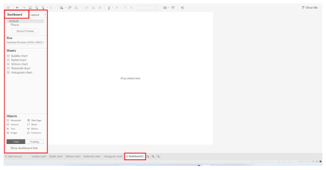

The Dashboard tab allows us to adjust the dashboard’s size. Dashboard dimensions can be customized based on our needs, such as width and height.
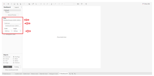

As shown in the screenshot below, you can also choose from a list of fixed dashboard sizes.

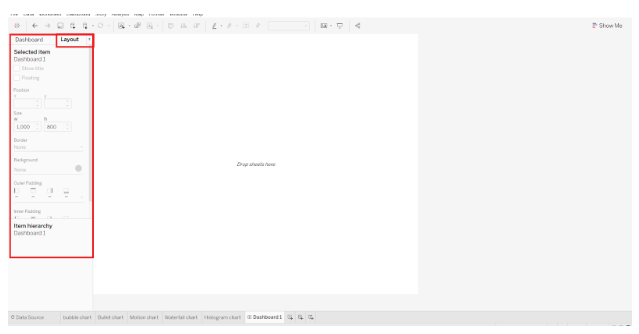
- Layout pane
Located next to the Dashboard pane is the Layout pane, where we can adjust the position, size, border, background, padding, and background color of the dashboard.

- Adding a sheet
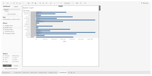
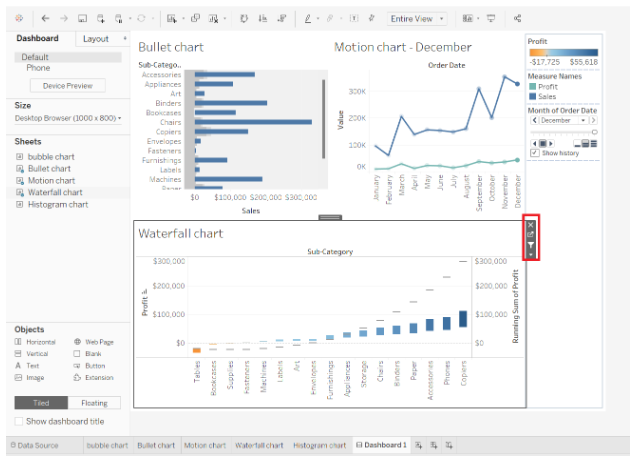
Let’s add a sheet to our empty dashboard now. You can add a sheet by dragging and dropping it from the Sheets column on the Dashboard tab. Our dashboard will display all the visualizations on that sheet. If you wish to change the size or position of the visual/chart/graph, click on the graph and then click on the small downward arrow at the right. Select Floating from the drop-down list. By doing this, your chart will be unfixed from one position so that you can adjust it as you wish.
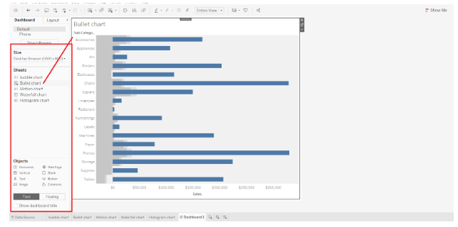

See how you can adjust the size of a sheet or visual by dragging it around on the dashboard.

- Adding more sheets
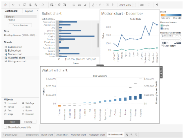
Similarly, we can add as many sheets as we need and arrange them appropriately on the dashboard.

You can also apply the filter or selections to one graph and treat it like a filter for all the other visuals. On the right of every visual in Tableau, select Use as Filter to add a filter.

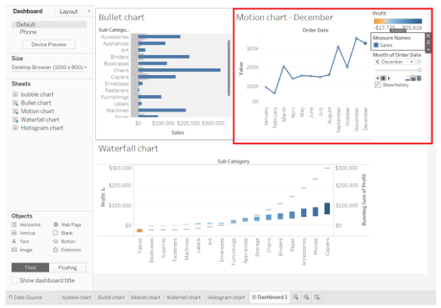

On the selected visual, we make selections. We removed the profits from the measures, thus only a motion chart based on sales is displayed.
- Adding objects
We also get tools in the Objects section to make our dashboard more interactive and dynamic. A wide variety of objects can be added, including web pages, buttons, text boxes, and extensions.


In the objects pane, we can add a button and select its action, i.e. what it should do when you click it. To explore the options for a button object, select the Edit Button option.


For instance, we add tableau image of our button as shown in the screenshot below.
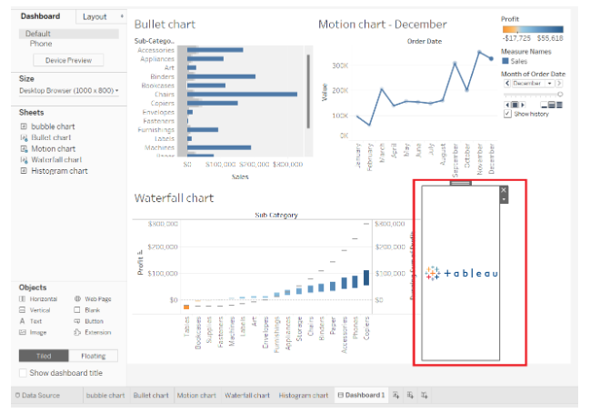

Thus a button gets created with what image you provide.
- Final dashboard
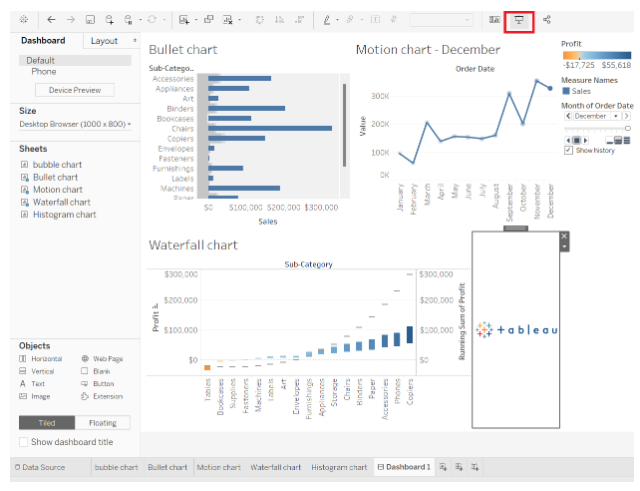
Our final dashboard in Tableau is in place with all the elements . In the screenshot below, you can see that we have three major visualizations on our dashboard, namely a bullet chart, waterfall chart, and a motion chart showing sales and profits.
- Presentation mode
When our dashboard is ready, we can view it in Presentation Mode. You can enable presentation mode by clicking on the icon on the top bar, as shown in the screenshot below, or by pressing F7.

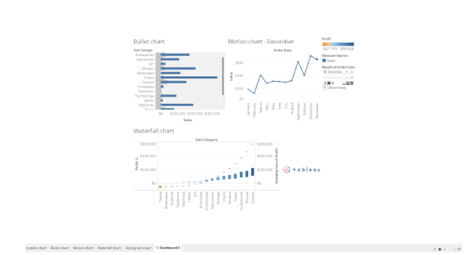
We are now in the presentation mode of our dashboard. We have been working in the Edit Mode so far.
The presentation mode neatly displays all the visuals and objects we have added to the dashboard. The dashboard can be seen in its final form before it’s presented to others or shared for analysis.

- Share workbook with others
Worksheets and dashboards that we create together can also be shared with other users as a workbook. To share the workbook, click the share icon (highlighted in red). The next step is to enter the Tableau server address.
Note – This requires a Tableau Online or Tableau Server account.


Initially, we learned how to add visuals from different sheets to a dashboard and how to arrange or format them.
Thus, this is how we can use the tableau dashboard for analysis and visualization.