Tableau – Scatter Plot
What is a Scatter plot?
A scatter plot is typically used to visualize two measure values or similar field values as a single dot on a graph. It is a two-dimensional graph in which the position of a data point or dot is determined by two measures; one on the x-axis and one on the y-axis. With Tableau, we can also add trend lines along with the dots to see and analyze the hidden trends in our data.
How to Create a Scatter plot in Tableau?
The following steps will guide you through the creation of a scatter plot in Tableau Desktop. For the purpose of explanation, we have compiled a set of sales data from an electronic store. To better understand the process, we will create a scatter plot based on this data. You may use your own data source to create a scatter plot that meets your needs.
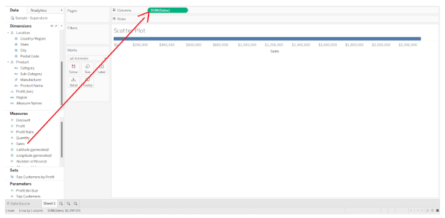
Step 1: Select the Measure
Connect your data source to the Tableau worksheet where you wish to create a scatter plot. Select a measure from the Measures section and drag it into the Columns section. In this case, we measured sales.
Step 2: Drag Measure to the Rows Section
Drag another measure from the Measures list to the Rows section. A measure of profit was taken.
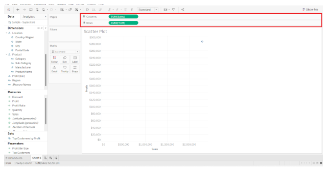
Tableau should automatically determine the type of chart that we should use based on the measures and dimensions that we select. Select Scatter plots from the Show Me visualization pane on the right if it has not already been selected.
Step 3: Select Two Dimension Fields
Our next step is to select two dimensions to provide values for the x and y axes. Here, we select two-dimension fields: Sub-category and place it in the Color box of the Marks card and Category.
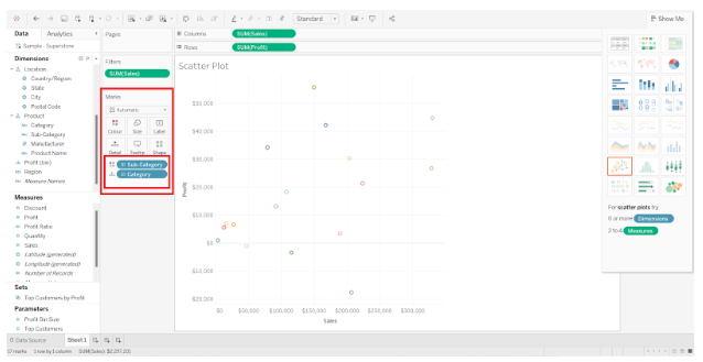
It creates a rough scatter plot with hollow circle shapes representing the value points for each brand. The left side of the screen displays the color scheme for each brand, i.e. the value of the subcategory field.
Step 4: Customize Scatter Plot in Tableau
In the next step, we can customize the appearance of the chart as per our preference by changing the color, shape, size, detail, etc. of the chart points. The Marks card allows you to manage such a setting by clicking on the respective boxes.
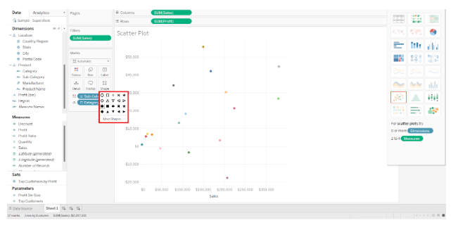
By right-clicking on the visualization and selecting the Format option from the drop-down list, you can edit the entire visualization and format the worksheet.
Step 5: Increase Detail of Scatter Plot
In addition, Tableau provides the option of increasing the detail of the scatter plot. For this purpose, we can add certain reference lines and trend lines to illustrate data trends. In the Analytics tab, you can add a trend line to your scatter plot. The Trend Line option can be selected, held, and dragged towards the scatter plot.
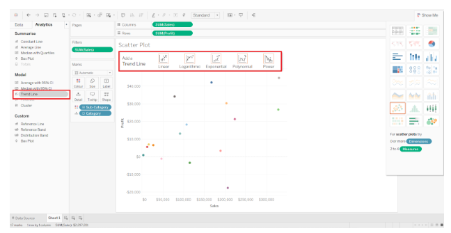
A hovering pane will display four options for trend lines. The Linear option is selected.
Step 6: Finalize Scatter plot in Tableau
The trend line will be created for each of the categories in our Category field. It is possible to infer the performance of a particular parameter instantly using trend lines.
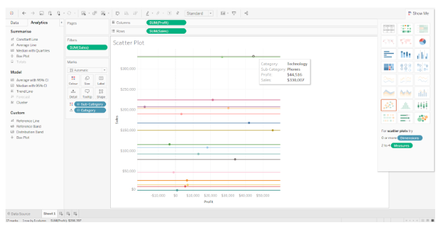
Based on our scatter plot, we can determine that with an increase in sales for the category, profit is also increasing.