Tableau – Sparkline Chart
What is Tableau Sparkline Chart?
Sparklines are small line graphs that illustrate a dataset’s general trend. Within groups, they are often useful for comparing trends.
The Sparklines are excellent tools for conveying a large amount of information in a small amount of space. A sparkline chart in Tableau can be created by creating a small multiple and formatting the small multiple so that it is smaller and without many axis labels.
As a first step, create a simple line graph. For a line graph, we need two continuous variables. I will use the Sample Superstore dataset to demonstrate this example and I will be using variables ‘Order Date’ and ‘Sales’.
Note: In tableau, if your date is in a date format, it is considered a discrete variable. Simply right-click, and drag the variable to the columns shelf, and you will see this window:
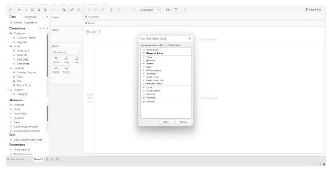
The green date options are continuous, whereas the blue ones are discrete. As a result, selecting one of the green options will convert the date to a continuous format.
Once you have completed the line graph, it should look like this:

In order to compare trends, the data must be divided into a variety of categories. Choose a dimension and drop it onto the rows shelf. As a result, your chart should look something like this:
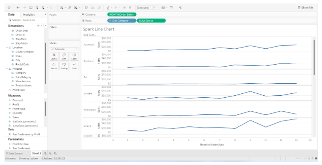
Although certain categories show a clear trend, others appear to be relatively flat. As tableau uses the same axis for all categories, it is difficult to identify trends in some categories, such as envelopes and fasteners.
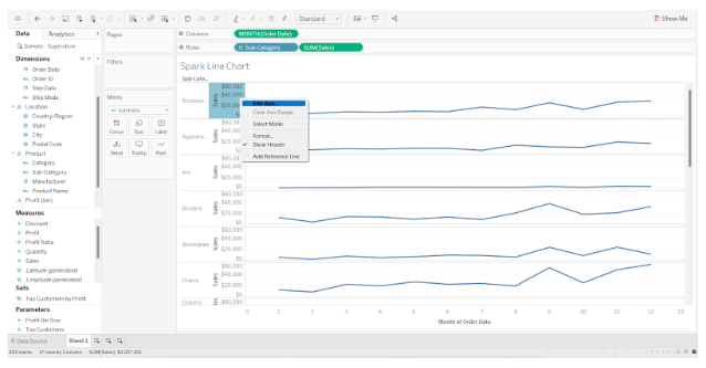
You can correct this by right-clicking on the axis and selecting Edit Axis from the drop-down menu. Change the axis option from “automatic” to “Independent axis ranges for each row and column.”. Each category’s axis will now be scaled according to its minimum and maximum values.
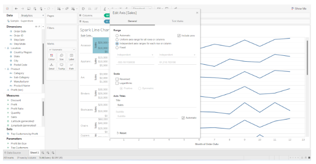
As a result, the chart should now look as follows:

All that remains is to format the chart so that it appears neat and easy to understand. As a result, begin by removing the header, since it adds little value to the chart. You can do this by right-clicking and unticking the display header box. I will also hide the field labels for the rows, although this is optional, since they add no value to this particular chart.
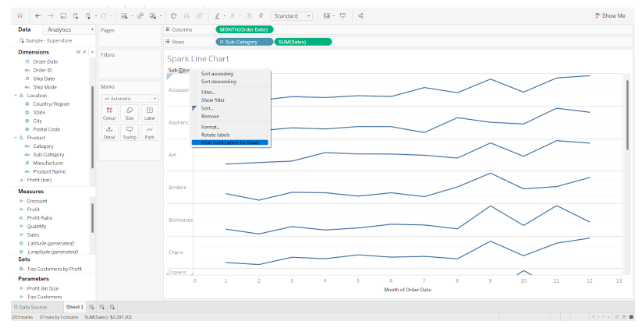
This will be the end result of the spark line chart

