Tableau – Treemap
What is Tableau’s Treemap
Tableau’s Treemap is a basic chart type represented by nested rectangular boxes. A chart like this can be useful for visualizing large datasets. Treemaps are graphs that can be used to compare hierarchical data. The treemap is an important chart for analyzing anomalies in a data set. Tree Maps have some limitations, including very limited customization options for the user and they are not efficient at representing data ranges. In Tableau, adding proper labels, colors, sizes and naming conventions to the treemap creates more meaningful visualizations.
Benefits of Treemap in Tableau
- When dealing with a large amount of data, this chart works really well. As data increases, so does the difficulty of understanding it. Treemap charts do not have this problem since the labels are associated with the data they represent.
- Treemap charts are an effective practice when you want to communicate and consume a lot of marks at once. By observing this crucial behavior, a user can easily spot patterns and relationships between them.
- Hierarchical data representation based on a tree-like structure.
Creating a treemap
In order to depict the no profit and no sales that occur in certain years, we will construct a treemap chart with related profit ratios.
In order to accomplish this, we will need the following information
- Region
- Year of Order
- No of sales
- Profit ratios
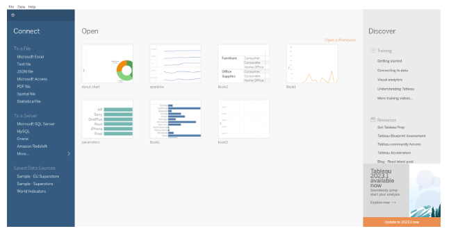
The following is an example of a blank tableau dashboard. As a user, we need to connect the tableau application to a dataset. Please refer to the screens below.
There is a ‘Superstore’ dataset preinstalled with the application in the main section (black area). This dataset will be used to construct a Treemap chart.
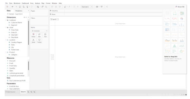
Once the Sample Superstore has been loaded completely. At the bottom of the screen, multiple tabs are listed that contain the content of the data set. This is a type of reference chart for working data. Once we create a new worksheet on the dashboard, you will see a screen similar to the one below –
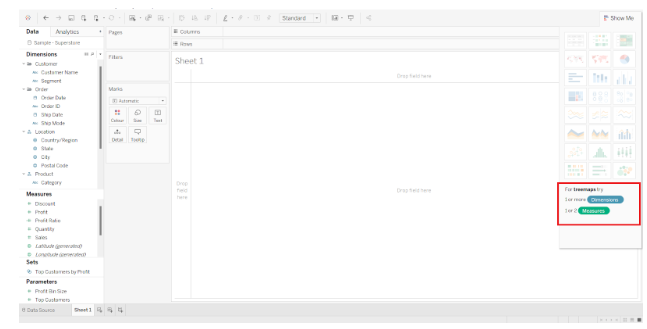
Note –Treemap charts consider and work only with two-dimensional data. As we can see in the above screen, there are sections for ‘Dimension’, ‘Measures’, and ‘Parameters’. All of these contain different types of data or methods of measuring data. The following screen illustrates that for a Treemap chart, at least one dimension and two measures are required.
Next, we will drag and drop data from the Dimension and Measure section. Here is where the actual chart creation process begins.
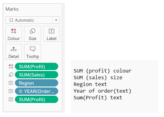
Our chart should include YEAR and REGIONAL details at the base. In order to do this, we drag and drop the Region and Year of Order dates to ‘Text’. Upon completing this step, we will receive the screen below.
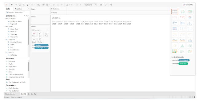
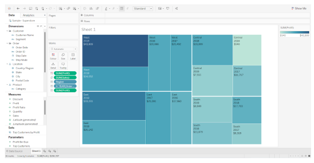
Tableau’s Treemap shows Regional details (like Central/East/South/West) and Year of Order details (like 2014, 2015….2017) clearly.
We will now add the Sales information to the chart by dragging and dropping ‘Sales’ into the ‘Size’ section (present under the Marks). Here is a screenshot of the screen mentioned below.

Now that we have added the ‘Profit’ to the chart, it will show the profits earned forgiven the no of sales in a particular region over a period of time.

Treemaps are based on this foundation, but we would like to order the profit according to color. We need to drag and drop the ‘Profit’ mark to the section titled ‘Colors’. Take a look at the screen below.
The data in the Marks section indicates what kind of information will be reflected there.
It is possible to customize the Treemap chart in tableau as needed, but the overall process remains the same, drag and drop the working data.
When showing cumulative totals for working data, the Treemap chart is preferred. When creating the chart, you may also include labels such as date, time, name, and budget.