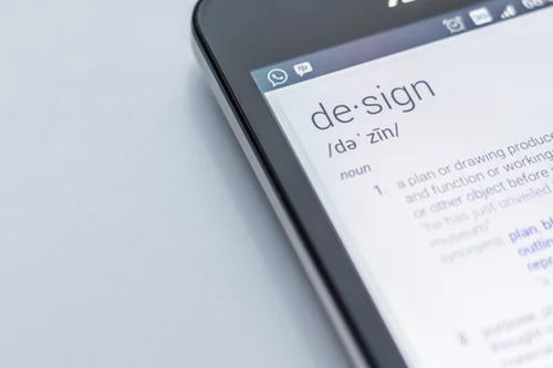
Tips on web design and UX that will help your business in 2018
What is important for e-commerce in 2018 – traffic? You can find out the number of visitors in analytics, but the main thing is the user experience (UX) – it is hidden between the figures of web statistics . Our current web design tips will help make the site interesting for each client .
In general, giving recommendations on web design is a thankless task, because many difficulty predictable factors influence the ultimate success of a business. Even with 1000+ successful web projects, it’s hard to say what works best and for what reason.
Today’s article contains detailed and scientifically based recommendations that will help make the site closer, more convenient and more attractive for each user.
Most of the recipes are supported by modern research and many years of web development experience. Here are simple UX ideas for beginners, and advanced recommendations for pros.
Top Tips for UX and Web Design 2018
For your convenience, we will break down today’s article into several sections on one or another aspect of the website.And let’s start with the most important thing – the template structure.
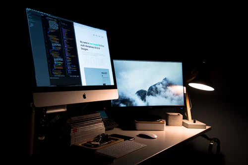
Web Page Structure Tips
Websites consist of two parts – the container and the content.The container, in turn, can be divided into structure and style. Let’s start with the first.
The tips listed below concern the structure and layout of the page elements.
1. Observe the visual hierarchy.
Each page has a specific visual hierarchy.If you are not familiar with the concept, here’s the definition: “The visual hierarchy is determined by the location, size, color and contrast of the elements of a web page. It determines their relative importance and the order in which they are detected by the eye. ”Web designers use a visual hierarchy to first of all draw visitors’ attention to important elements.For this, the position (higher or lower), dimensions (larger or smaller), visual effects (video, images, icons) and contrast (negative space) are thought out.The combination of these techniques enhances the effect.Everyone will see a large video high up on a page surrounded by contrasting negative space.On the other hand, few people will notice the tiny gray text on a white background, hidden near the site’s footer.
2.Use a descriptive title with keywords.
The title at the top of the home page is either descriptive or useless.If the second, the visitor will not be able to answer his first question: “I got to the address?”
The title is a unique opportunity to use the target key phrase and indicate relevance. But many marketers write something clever or vague.
Rule number one: a clear heading is better than a clever one.He just has to explain the company’s activities and put you in a good light.
3.Do not place all calls to action at the top of the page.
Yes, visitors spend the most time in the header area, but this does not mean that they are prepared to perform the target action after reading a few lines! Many conversions occur after a complete familiarization with the page.
When Chartbeat experts analyzed 25 million web visits across the Internet, it turned out that the largest number of conversions occur well below the header.
Do not focus only on the top – leave the CTA for the middle and footer.
4. Design long pages. Answer all questions
More pixels — more space for answers, counter objections, and social evidence. If the visitor did not find the answer to an important question, he continues scrolling.
A successful e-commerce page is a simulator of the seller’s dialogue with the buyer. Interrupting the dialogue in mid-sentence leaves open questions and does not lead to conversions.
Rule number two: ALL short pages break the conversion process.
Evidence in the studio! Crazy Egg’s famous marketing research has forced the agency to make the homepage 20 times longer. The result is a 30% increase in conversions.
5. Beware of “fake bottom”
Modern marketing sites, especially those selling, are built from blocks of content.
They consist of bricks, where the text is in one, the image is in the second, and together these blocks form a monolithic wall. But pay attention to the basement of this building.
The site’s footer is usually made darker, so that the visitor understands the scrolling process – the end of the page is approaching. If you make the element in the middle of the page dark, this technique will work against you. The person will think that he has reached the basement and will stop!
This web design trap is called a “fake bottom”. Do not get caught!
To secure your business, use minor variations in shades when developing content blocks. The sharper the contrast, the higher the probability of stopping.
You can check the activity of users on the page using the heat map.
6. Discard tabs and expanding blocks.
In 2018, web design continues to move away from tabs and expanding blocks of content.
You should have heard that 76% of site visitors belong to “crawlers”, that is, they skim through content and do not peer into the comma arrangement.
Rule number three: scrolling faster and easier than clicking.
Tabs and all sorts of expanding elements from the content are extremely inconvenient, unpleasant for the always rushing audience. If people do not have time to click on tabs, they will not see your interesting content and will not be converted.